The old cliché goes that “A picture is worth a thousand words”. This may be overused, but I feel this is particularly relevant in data analysis, and we often use diagrams as tools to quickly communicate the results of our complex statistical models. However, whilst we often prioritise on explaining the results of the analysis, we are often less inclined to explain the stages used to reach the results to the same level of detail.
In this post, I highlight some of the great features of making diagrams in R, and highlight how they can be easily connected to data from your analysis to produce dynamic data flowchart. This can make it much easier for readers to engage with your data analysis and understand how your complex models work.
Making diagrams in R
The DiagrammeR package (Iannone 2018) is a package which allows graphs to be generated for a simple coding syntax. Graphs are primarily drawn in the DOT language using the GraphViz and `mermaid styles. The package also provides a useful interface for creating graphs directly from R code. To get started we first need to install the package:
install.packages("DiagrammeR")The creation of figures in R is further simplified by the integration with RStudio, which provides native support for .dot, .mmd or .gv files which can be used for containing charts. RStudio provides syntax highlighting for any of these files, and allows you to quickly preview the results of the diagram within the view window, as shown in Figure 1
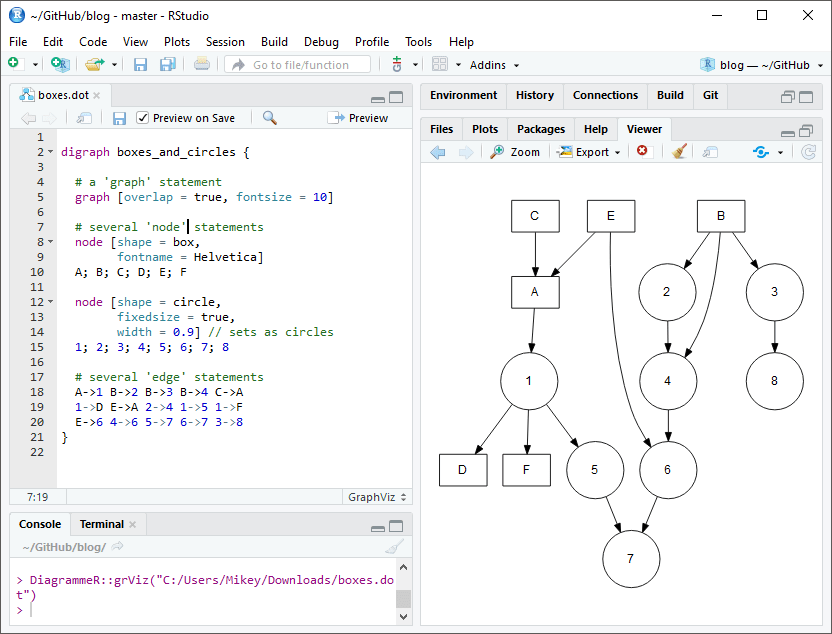
Figure 1: Using Graphviz within R Studio
While this guide by no means attempt to replace the detailed guidance provided on the package website, it is important to highlight a few of the basic features of the plots. DiagrammeR uses the processing function called grViz(). What you pass into grViz() is a valid graph specification in the DOT language, with the figure being supplied as either an external file or inline code within R.
There are many different types of graphs which can be drawn, but in this post we will focus on directed graphs (diagraph), which are most typically used within flowcharts. This must be specified at the start of the plot.
Graphs can be controlled by three functions:
graph: this sets the overall layout, themes of the plotnode: the boxes in the flowchartedges: the lines used to connect each of the boxes
A minimal example is shown in Figure 2:
# A minimal plot
DiagrammeR::grViz("digraph {

graph[layout = dot, rankdir = LR]

a
b
c

a -> b -> c
}")
Figure 2: A minimal example
You can see above that the plot is very simple, and it is likely that you will want to change the style of the boxes by adding colours etc. To do this, you can define as many styles as we wish within square brackets following the object using name-value pairs. You may wish to see the full list of node shapes available here
For example, if we wanted to set the fill colour of node box1, or change the style of the arrowhead of a connector we can use the following code:
box1 [fillcolor = red]
abc -> def [arrowhead = diamond]
A crucial option to specify is the label option, which lets us change the text within the shape. . We will piece together some of the examples below to highlight a more complex graph:
DiagrammeR::grViz("digraph {

graph [layout = dot, rankdir = LR]

# define the global styles of the nodes. We can override these in box if we wish
node [shape = rectangle, style = filled, fillcolor = Linen]

data1 [label = 'Dataset 1', shape = folder, fillcolor = Beige]
data2 [label = 'Dataset 2', shape = folder, fillcolor = Beige]
process [label =  'Process \n Data']
statistical [label = 'Statistical \n Analysis']
results [label= 'Results']

# edge definitions with the node IDs
{data1 data2}  -> process -> statistical -> results
}")
Figure 3: A basic flowchart
Parameterized figures
A great benefit of designing figures within R is that we are able to connect the figures directly with our analysis by reading R values directly into our flowcharts. For example, suppose you have created a filtering process which removes values after each stage of a process, you can have a figure show the number of values left in the dataset after each stage of your process. To do this we, you can use the @@X symbol directly within the figure, then refer to this in the footer of the plot using [X]:, where X is the a unique numeric index. Here is a basic example:
# Define some sample data
data <- list(a=1000, b=800, c=600, d=400)


DiagrammeR::grViz("
digraph graph2 {

graph [layout = dot]

# node definitions with substituted label text
node [shape = rectangle, width = 4, fillcolor = Biege]
a [label = '@@1']
b [label = '@@2']
c [label = '@@3']
d [label = '@@4']

a -> b -> c -> d

}

[1]:  paste0('Raw Data (n = ', data$a, ')')
[2]: paste0('Remove Errors (n = ', data$b, ')')
[3]: paste0('Identify Potential Customers (n = ', data$c, ')')
[4]: paste0('Select Top Priorities (n = ', data$d, ')')
")
Figure 4: A flowchart containing R code replacement
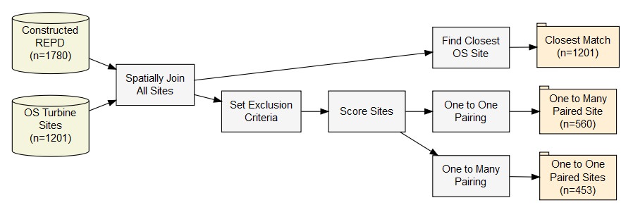
The code for the chart in the header image is also available here
Subgraphs and clusters
This post is not designed to be a comprehensive guide of DiagrammeR, but it is worth highlight that we can use subgraphs and clusters to demonstrates groups within the data. Figure 5 highlights an example of a graph I have produced within my analysis to show the classification of data across different categories within my model. The code used to make this graph is available through the GitHub repository here.
Figure 5: An example of subgraphs used to highlight grouping within a dataset
Further Resources
If you want to read the full documentation of the package you should check out the website here: http://rich-iannone.github.io/DiagrammeR/ . The features extend well beyond what is explained within this brief post.
If you have made any data-driven R Markdown graphs, I would love to see them! Feel free to share any examples of using it in the comments below.
References
Iannone, Richard. 2018. DiagrammeR: Graph/Network Visualization. https://CRAN.R-project.org/package=DiagrammeR.