Visualising Neighbouring Polygons in R
A while back on StackOverflow, I answered a question on how to produce a map which showed how many polygons away a location was from another. This blog provides an update on how this can be used, with some slight tweaks to the answer to expand on the original. A lot of this content is based around the original from Roger Bivand here.
Setup
In order to calculate neighbouring polygons, we need to form a network of nodes for the data. This is done using the igraph, spdep and spatialreg packages. We also use the raster package to download some example data, and ggplot2 for the final visualisation.
# Loading example datalibrary(raster) # loads shapefile
# Data Analysislibrary(igraph) # build networklibrary(spdep) # builds networklibrary(spatialreg)
# Visualisationlibrary(RColorBrewer)  # for plot colour palettelibrary(ggplot2) # plots resultslibrary(tmap)
First downloading the data as follows. The input data is shown below. You could easily provide your own shapefile here instead or run the code for a different country by changing the three-digit code. For my example, I have selected Hungary:
# Load Databoundaries <- raster::getData(name = "GADM", country = "HUN", level = 2)
# Show datatm_shape(boundaries) +  tm_polygons()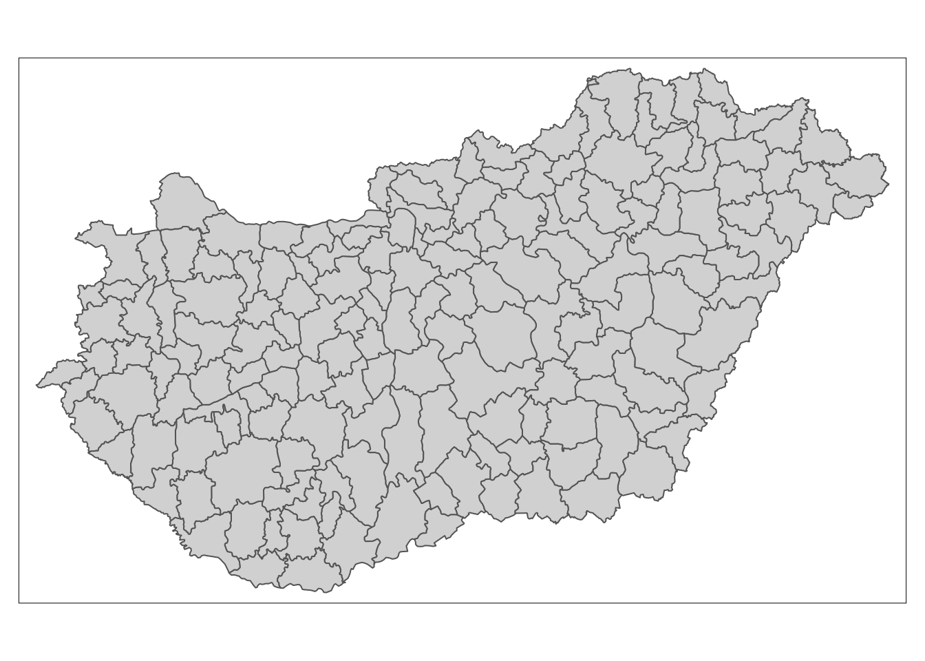
Extracting neigbours
Firstly the poly2nb function is used to calculate neighbouring regions, based on contiguous boundaries, that is sharing one or more boundary point. The resulting mesh and coordinates is shown below.
# Find neighbouring areasnb_q <- poly2nb(boundaries)
# Plot original resultscoords <- coordinates(boundaries)
# Show the resultsplot(boundaries)plot(nb_q, coords, col="grey", add = TRUE)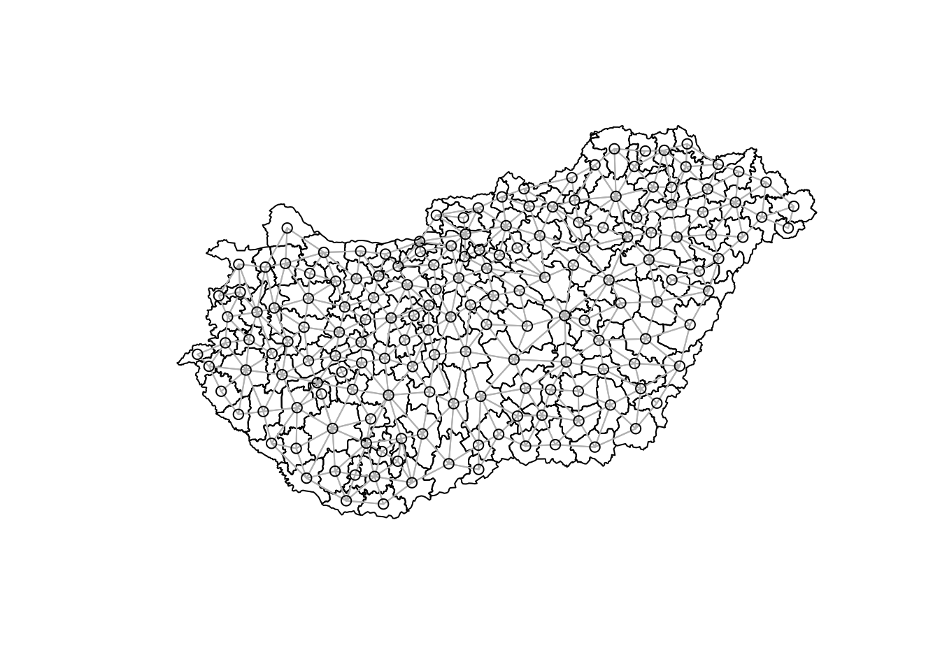
With this mesh, we can then calculate the shortest path between two locations. The follow function returns a list for each and every pair of polygons.
# Sparse matrixnb_B <- nb2listw(nb_q, style="B", zero.policy=TRUE)B <- as(nb_B, "symmetricMatrix")
# Calculate shortest distanceg1 <- graph.adjacency(B, mode="undirected")sp_mat <- shortest.paths(g1)
Having made the calculations, the data can now be formatted to get into plotting format, so the shortest path matrix is merged with the spatial dataframe.
# Name used to identify datareferenceCol <- boundaries$GID_2
# Rename spatial matrixsp_mat2 <- as.data.frame(sp_mat)sp_mat2$id <- rownames(boundaries@data)names(sp_mat2) <- paste0(referenceCol)
# Add distance to shapefile databoundaries@data <- cbind(boundaries@data, sp_mat2)boundaries@data$id <- rownames(boundaries@data)
The data is now in a suitable format to display. Using the basic function spplot we can get a graph quite quickly:
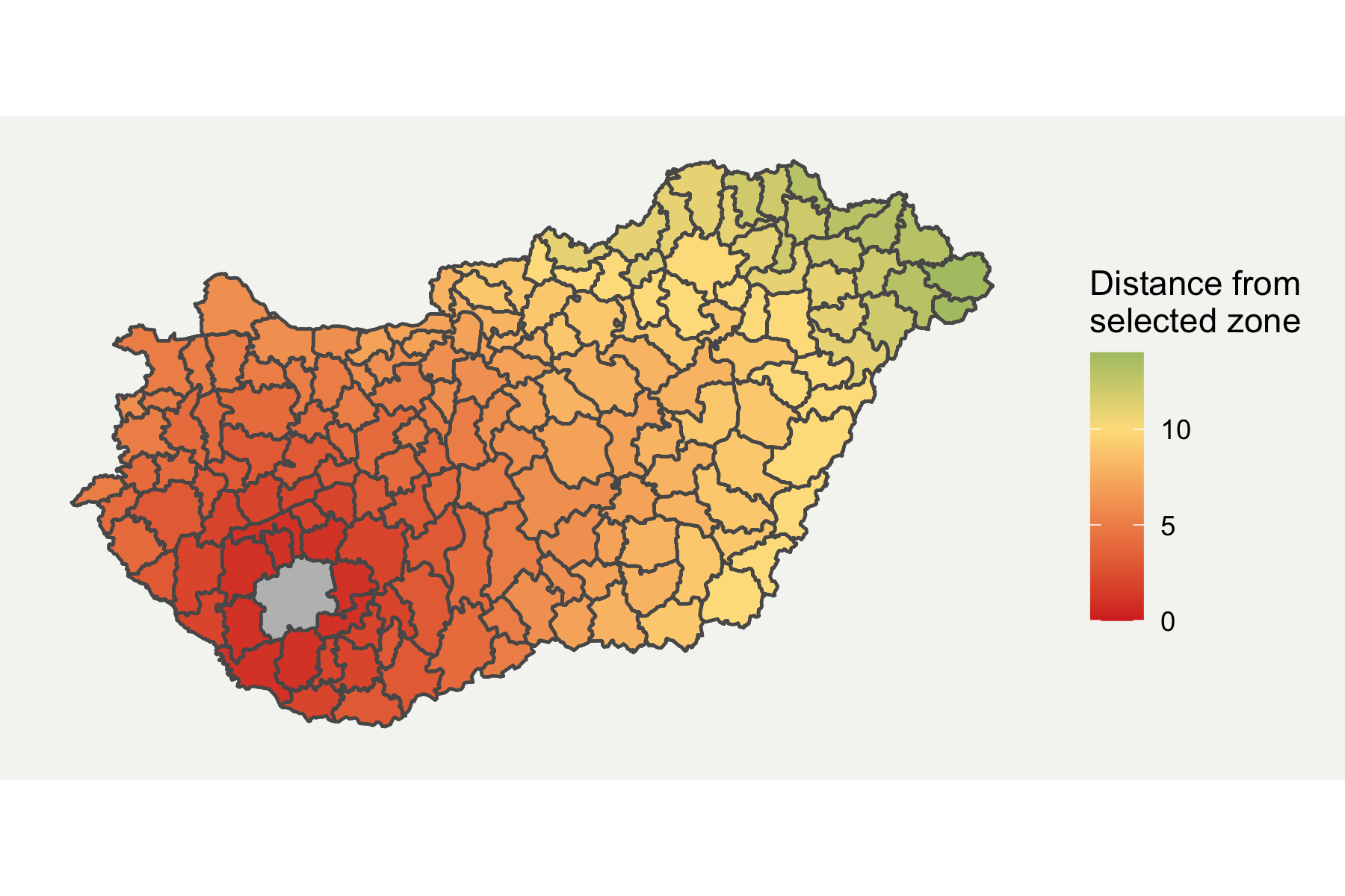
tm_shape(boundaries) + tm_polygons("HUN.15.5_1", n = 15)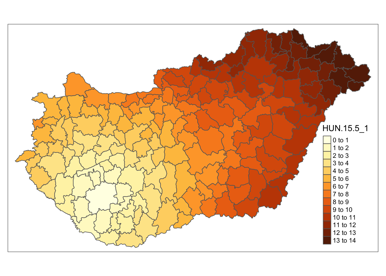
Plotting in ggplot2
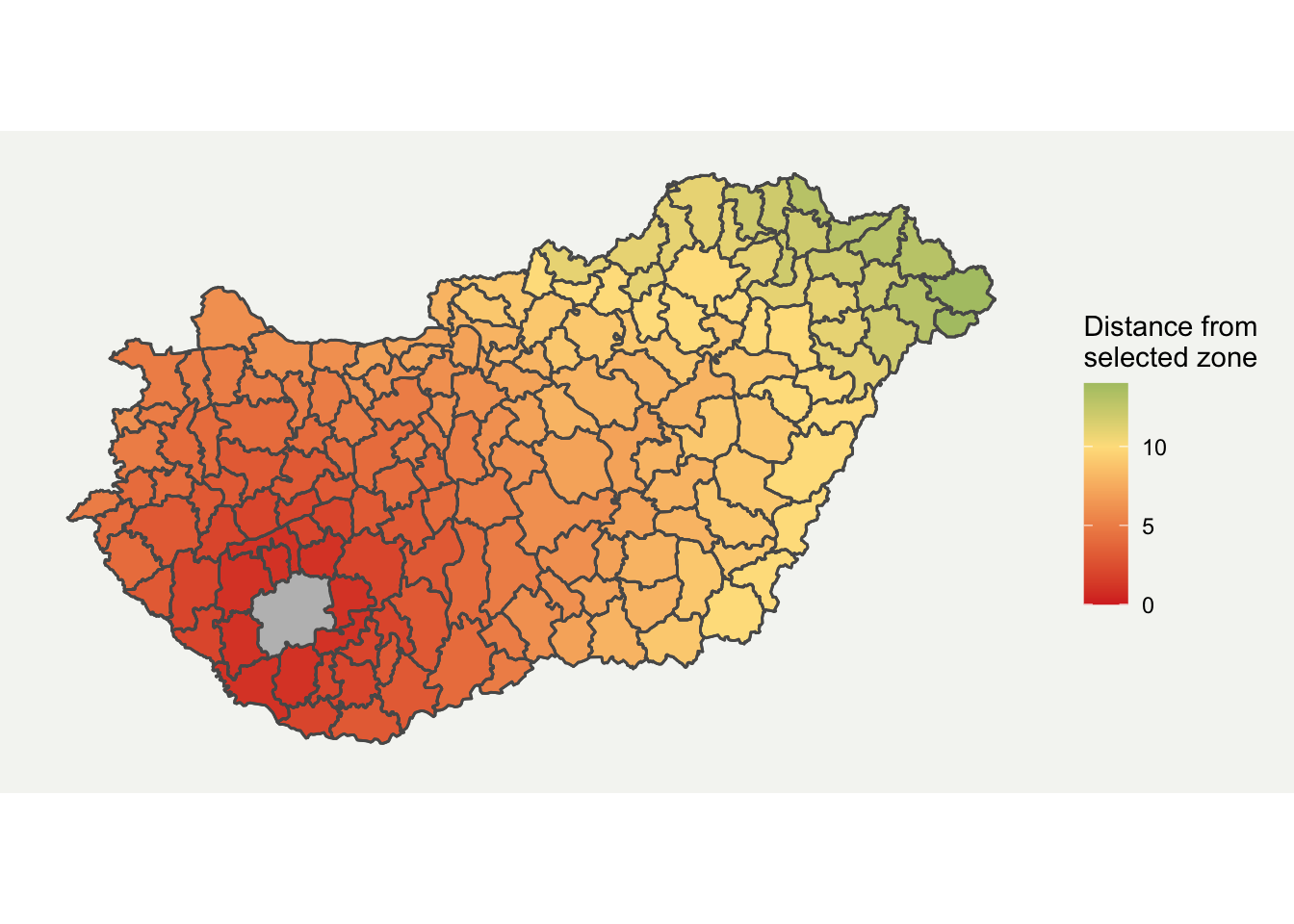
I prefer ggplot for plotting more complex graphs as you can control the styling easier. Fortunately, ggplot2 now directly supports spatial data through geom_sf format. I have customised it a bit by removing elements which aren’t required and added a background. The final map is shown below.
# Convert data to sf formatboundaries_sf <- sf::st_as_sf(boundaries)
ggplot(boundaries_sf) +  geom_sf(aes(fill = HUN.15.5_1)) +  geom_sf(fill = "grey", alpha = ifelse(boundaries_sf$GID_2 == "HUN.15.5_1", 1, 0)) +  scale_fill_gradient2(low = "#d73027", mid = "#fee08b", high = "#1a9850", midpoint = 10) +  labs(fill = "Distance from \nselected zone") +  theme(    axis.line = element_blank(),    axis.text.x = element_blank(),    axis.text.y = element_blank(),    axis.ticks = element_blank(),    axis.title.x = element_blank(),    axis.title.y = element_blank(),    panel.grid.minor = element_blank(),    panel.grid.major = element_blank(),    plot.background = element_rect(fill = "#f5f5f2", color = NA),    panel.background = element_rect(fill = "#f5f5f2", color = NA),    legend.background = element_rect(fill = "#f5f5f2", color = NA),    panel.border = element_blank())