Why COVID positivity rates and deaths don't always correlate
In the tweet thread here, Joel raises concerns around the Covid Positivity rates and the strange relationship these have with Covid deaths. Kudos to him, he put the question out for peer review, so it seemed like a great opportunity to get some analysis out!
The tweets
I wasn’t going to tweet this because I cannot make sense of it. Nor can my colleagues. So, I’m going to open source it and see if the wider community can verify or refute this.
— Joel Smalley (@RealJoelSmalley) January 7, 2021
To prove this empirically, I ran a linear regression between the two series and solved for an optimal lag between positivity and deaths. 12 days also seems reasonable given infection-to-death interval is known to be between 18 and 25 days. But things look a bit crazy in the end! pic.twitter.com/6mkfde2E8g
— Joel Smalley (@RealJoelSmalley) January 7, 2021
So, the big question here is about the strange behaviour of the regression relationship between the ONS Infection Survey and Covid deaths. Intuitively, we might expect this to be fairly linearly, but it has that weird squiggle in the middle. What is going on?!
At first sight, the idea that linear regression is a suitable tool for this seems to hold true. We are told constantly that deaths normally happen 2 weeks after an infection, and therefore on the surface this all made sense. But on deeper inspection, there is more going on, and this post aims to provide a explanation for what seems a likely cause of this non-linear behaviour.
For transparency, this entire analysis is based off the publicly available datasets, and completed with the code available (written in R). Sorry if the code is messy, or not even wanted: mostly written fuelled by late night coffee.
Average Time to Death hides part of the picture
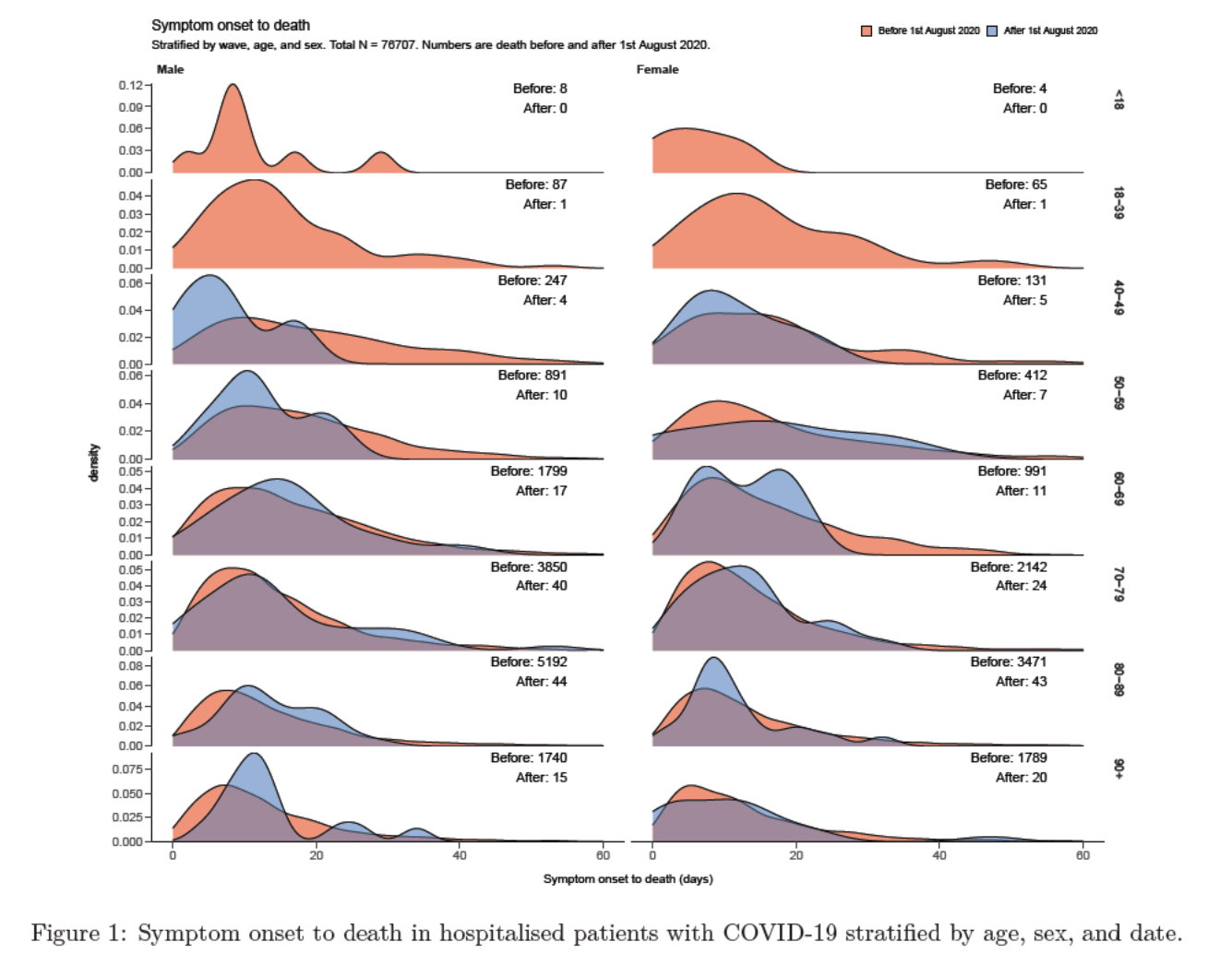
A lot of emphasis falls on the average time to death, however the reality of it can vary massively with a broad length of time from infection to death. Several pieces of research have explored this relationship, including a report here which focusses on the UK. The above graph goes into more detail than potentially needed for the point, but it does show usefully how the timespan varies.
So why does this matter? Well, it means that each day is not a truly independent observation, and therefore introduces collinearity between the points more information here. The deaths on a particular day are a function of the deaths on the previous 30, even 60 days. It is therefore not possible to say that all the deaths on a single day can be attributed to infections from another, and therefore we must consider more than just a one-to-one relationship.
Demonstrating the concept
Well I can’t just say it is an issue and then do nothing about! To highlight the issue, I thought I would simulate some data to show that we should not expect there to be a linear relationship between infections and death rate. To do this requires several steps:
- Calculate a symptom-to-death curve
- Compare this with infection rates
- Derive a daily death index
My aim here was to try and demonstrate that the non-linearity of the data here is something which is to be expected.
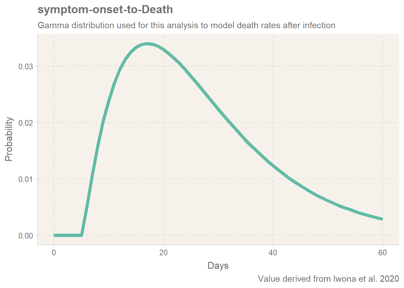
Calculating a symptom-to-death curve
Rather than using an average time to death, we can more reliably understand the death rate if we look at the probability of death with time. To do this, we can select a probability function which provides a good estimate of the likely death rate. For this I have derived from Iwona et al. 2020, who suggest that a Gamma distribution is suitable. I will instantly flag that this study was done in August, and since then the survivability of Covid-19 has improved due to improved medical knowledge, but the point here is not to give an accurate projection of the death rate.
Note, this is the symptoms-to-death. We also need to include the average incubation period of 5 days. Again, we could argue this is an average and should include a distribution, but it a fairly small factor so I will ignore any uncertainty on this value. The derived probability function is shown below:
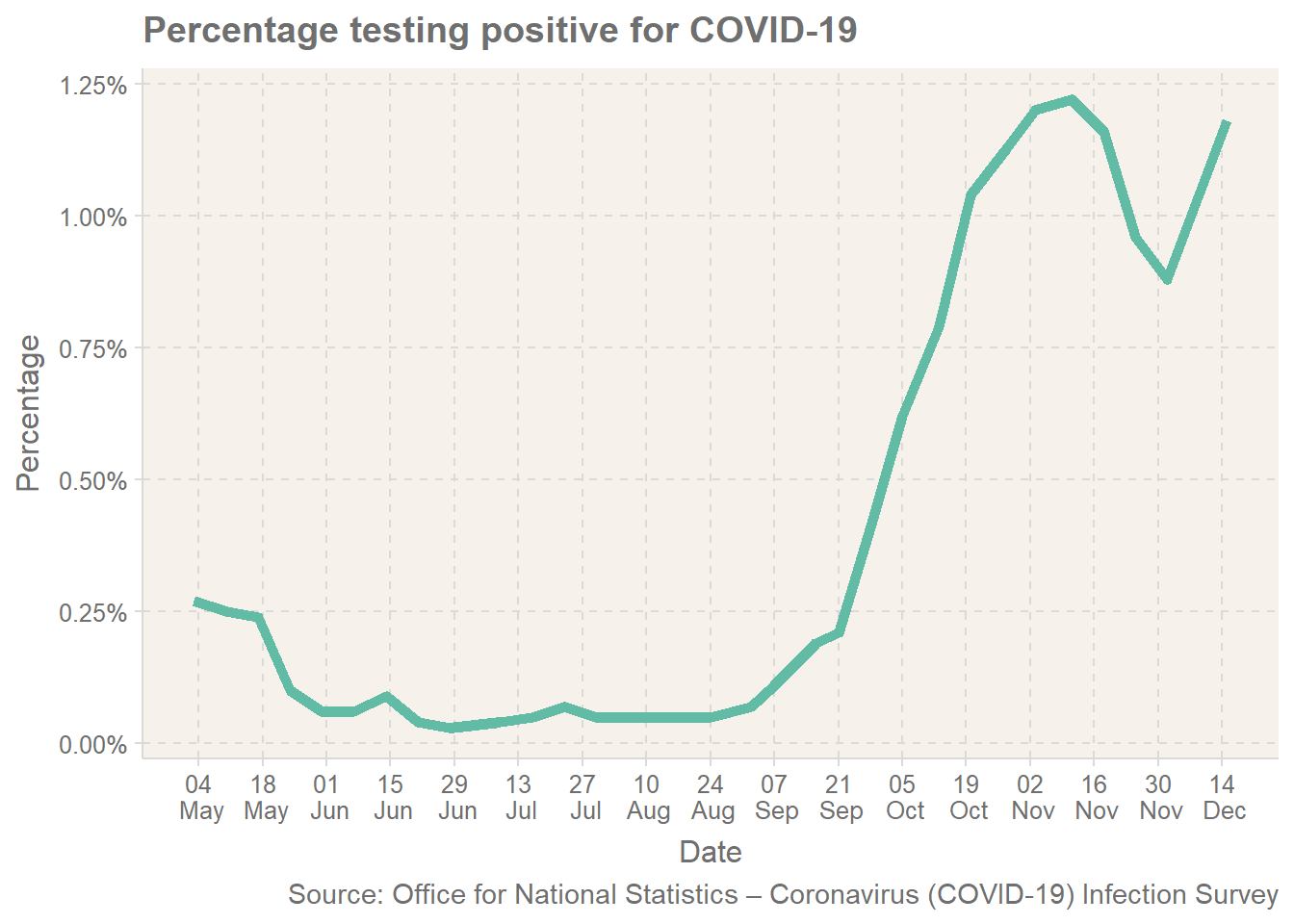
Infection Rates
The second important piece of information is the infection rate. This is provided by the ONS survey, with the data available here. Note the data is slightly out of date, and therefore will not provide me with loads of data for December.
Simulate a death dataset
Based on the two values, we can now simulate how death may vary with infection levels. To do this, I will take the daily infection rate, and project the expected level of death for the following time period. To help make a direct comparison, I will only look at deaths within 28 days of a positive test. I will make the assumption here that tests were only taken after concerns of symptoms (5 days).
Note, for the purpose of this comparison, I don’t actually need the absolute number: I am more interested in the relative pattern of the data for the comparison. In fact, I am trying to actively avoid giving an exact number of death, as for this I would need more information: there are too many additional variables needed to accurately model the death, so it would be misleading to even suggest this.
As the average positive infection lasts 4 week reference, I will divide my infection rates by 28 to avoid overly boosting the figures as I am calculating this daily. For each day, we will forecast forwards. If the code below looks like it was written in a hurry late at night, then you are correct!
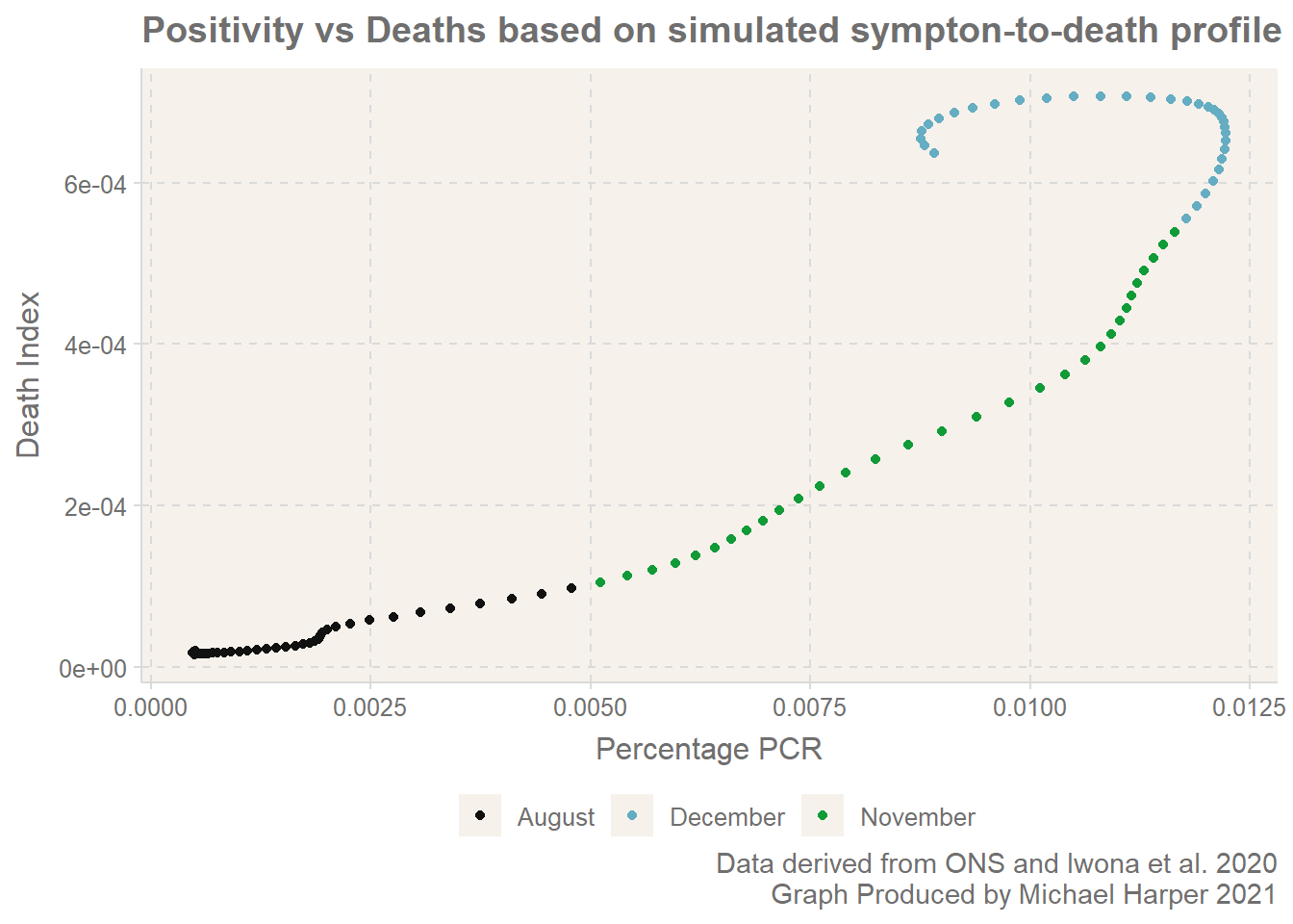
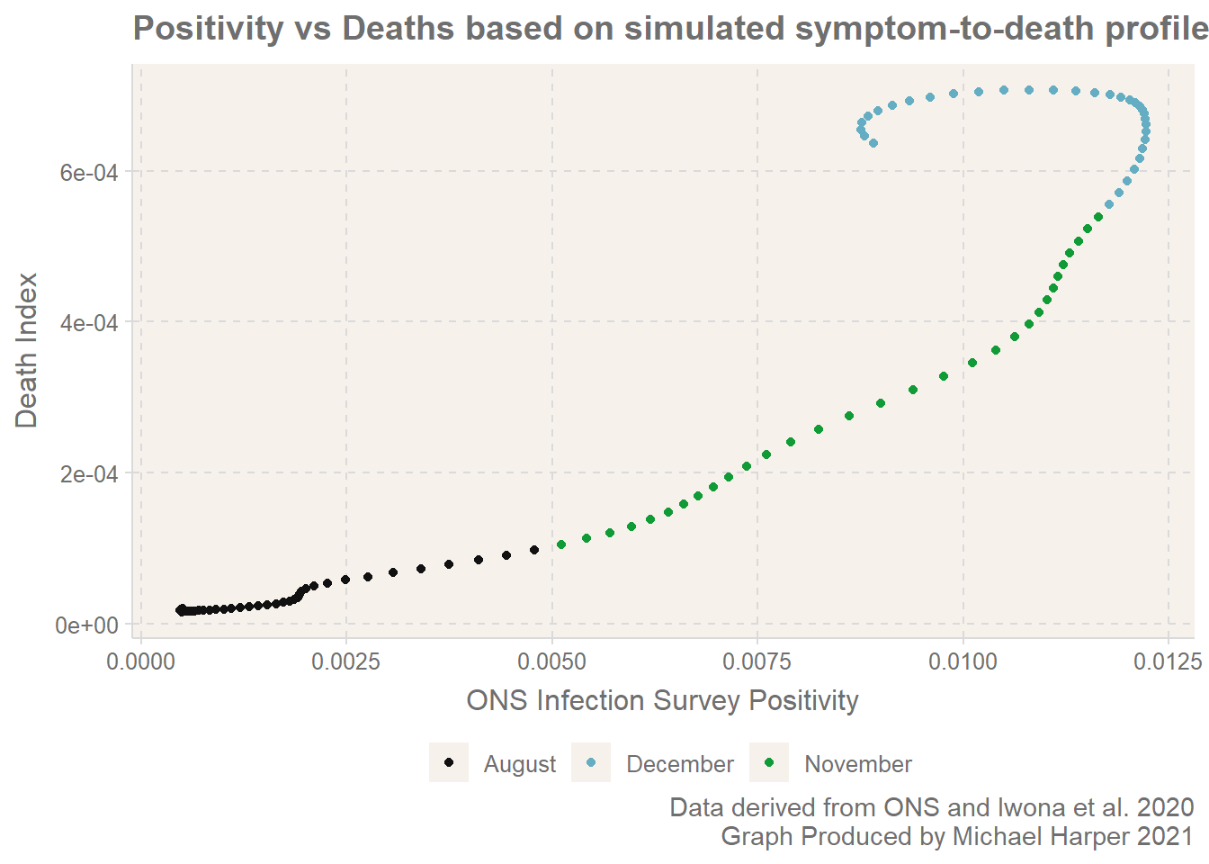
Results of Simulation
After this processing, we have a data frame which gives us three columns: Date, Percentage which refers to the ONS Covid Survey Infection Rate and deathIndex a value which indicates the level of death we would expect on that day given the infection rate from the previous 33 days. Finally, period indicates the time period to help compare the work with Joel’s analysis.
We can also look further forward and compare the number of deaths X days ahead of the date. Here we go 12 days ahead for comparison with the results from Joel. And look, here we have. It exhibits the clear kick backwards and starts the looping on itself. The line is by no means as jumpy as the results from Joel, but this is because of the simplicity of the model.
It appears the graphs made by Joel include some more data which I have not been able to source?
What is happening?
In times when there are slow and gradual changes in the infection rate, there may be the illusion that the infection rates and deaths are directly correlated. However, when there are rapid shifts in the level of infection rate, either upwards or downwards, we are likely to see that the linearity begins to break down.
To reflect specifically on what has happened on the UK, we have undergone a fairly inconsistent few months. The combination of the lockdown in early November, the new strain, Christmas mixing and now the next lockdown have led to quite rapid shifts in the infection rates. To further complicate things, many of these events have happened within the 28 days of each, and therefore the death statistics will be difficult to separate entirely for each event.
Conclusion
I hope this provides a useful overview of how statistics don’t always behave as you might always believe! We can expect there to be intuitative relationships between datasets, but it is only when you dig deeper into the mechanisms of how things behave that you appreciate the factors.
If you have any queries or questions, I welcome comments! This is really designed as a rough-and-ready example to highlight the data. If you would like to see the source code and data for this, feel free to check out this article on GitHub here