Animated Plots with R
Data scientists are blessed with a range of software tools which they can use to visualise results, and provide loads of great ways to present data which is equally informative and visually compelling. The increasing popularity of R ggplot2 has made many people familiar with static plots, but animated plots can be an effective way to communicate results, and there are few better examples than the use of them in the now famous TED talk by Hans Rosling.
In this post, I wanted to show an example of how animated plots can be used to convey geospatial data.
Note, since this originally written, there have been a few rebuild of the gganimate package. See the new repository for information: https://github.com/thomasp85/gganimate
Example Data
A lot of my research is around renewable energy, in particularly modelling onshore wind energy within the UK. Fortunately, the UK is great for open data, and the UK government record all renewable energy planning applications. Over 5000 projects are recorded, providing planning status, technology type, and most crucially for this example, the location of the project.
Example 1: Renewable Energy Locations
The ggplot facet is a commonly used tool for displaying similar datasets. However, an animation can also be used to visualise the results as a single plot, but rotate through each of the layers avaialble. For example, using the example renewable energy dataset, we can display the locations of each renewable energy technology in the UK.
If you are using ggplot, and only want to create an animated plot containing a single figure, I would recommend the gganimate package. It provides a convenient wrapper to the animation package, and animated plots can be created by adding a frame variable to a ggplot layer, and then using the gganimate function to call the plot. The results are shown below.
library(gganimate)
# filter dataREPD_tech <-REPD %>%filter(`Status.Summary` == "Approved")
# build GIFp <-  ggplot() +  geom_polygon(data=UK, aes(long, lat, group = group), fill = "#528076") +  geom_point(data = REPD_tech, aes(x = `X-coordinate`, y = `Y-coordinate`, fill = `Technology Type`),             size = 5, shape = 21, alpha = 0.7) +
  # gganimate parts  transition_states(`Technology Type`, transition_length = 2, state_length = 20) +  enter_fade() +  exit_fade() +
# Styling  coord_equal(xlim = c(-75000, 825000), ylim = c(0, 1200000)) +  theme(panel.grid.major = element_blank(),        panel.grid.minor = element_blank(),        axis.text = element_blank(),        axis.title = element_blank(),        axis.ticks = element_blank(),        panel.background = element_rect(fill = "grey99", colour = "grey80"),        plot.title = element_text(hjust = 0, size = 16, vjust=0))

animate(p, length = 15, width = 700, height = 400)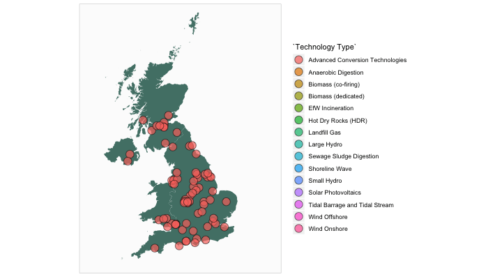
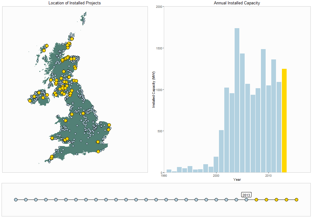
Example 2: Development of Onshore Wind
Time-series data can be interesting to plot using an animation. For example, we can view the development of onshore wind within the UK. A three element plot was formed to show the number of wind turbines installed within the United Kingdom each year:
- A map shows the location of the wind turbine planning application, highlighting the year in focus in gold
- A bar plot shows the total installed capacity of wind turbines within the specified year
- A timeline is plot along the bottom to show the progress through the years.
As we have used three separate graphs, it is not possible to use gganimate.
The final result is shown below. To organise the layout, I have used the fantastic patchwork, which makes it really easy to align multiple ggplot objects. I would recommend checking out the package here.
# Only show constructed wind turbinesREPD_wind <-  REPD %>%  filter(`Technology Type` == "Wind Onshore") %>%  filter(Status.Summary == "Approved")
# Create gifinvisible(saveGIF({  for (i in 1990:2017){
  p <-    ggplot(data = NULL, aes(x = `X-coordinate`, y = `Y-coordinate`)) +    geom_polygon(data = UK, aes(long, lat, group = group), fill = "#528076") +    geom_point(data = filter(REPD_wind, year < i),               fill = "#b2d1e0", size = 3, alpha = 0.8, shape = 21) +    geom_point(data = filter(REPD_wind, year == i),               fill = "gold", size = 5, shape = 21) +    coord_equal(xlim = c(-150000, 900000), ylim = c(0, 1200000)) +    labs(title = "Location of Installed Projects") +    theme(panel.grid.major = element_blank(),          panel.grid.minor = element_blank(),          axis.text = element_blank(),          axis.title = element_blank(),          axis.ticks = element_blank(),          panel.background = element_rect(fill = "grey99", colour = "grey80"),          plot.title = element_text(hjust = 0.5))
  p2 <-    ggplot(filter(REPD_wind, year <= i), aes(x = year, y = `Installed Capacity (MWelec)`)) +    geom_col(aes(fill= year >= i)) +    scale_fill_manual(values = c("#b2d1e0","gold")) +    scale_x_continuous(limits = c(1990, 2018), expand = c(0,0)) +    scale_y_continuous(limits = c(0, 2000), expand = c(0,0)) +    labs(title = "Annual Installed Capacity", x = "Year", y = "Installed Capacity (MW)") +    theme(legend.position = "none",          panel.grid.major = element_blank(),          panel.grid.minor = element_blank(),          panel.background = element_rect(fill = "grey99", colour = "grey80"),          plot.title = element_text(hjust = 0.5))

  p3 <- ggplot(data = NULL, aes(x = 1990:2017, y = 1)) +    geom_line() +    geom_point(aes(fill = (x = 1990:2017 > i)), shape = 21, size = 5) +    theme_void() +    theme(legend.position = "none") +    scale_fill_manual(values = c("#b2d1e0","gold")) +    geom_text(aes(x = i, y = 1, label = i), vjust = -1, size = 9) +    theme(panel.background = element_rect(fill = "grey99", colour = "grey80"))


  # Print plots using patchwork  print(p + p2 - p3 + plot_layout(ncol = 1, heights = c(5, 1)))  }

}, movie.name = "windDevelopment.gif", interval = 1, ani.width = 1000, ani.height = 700))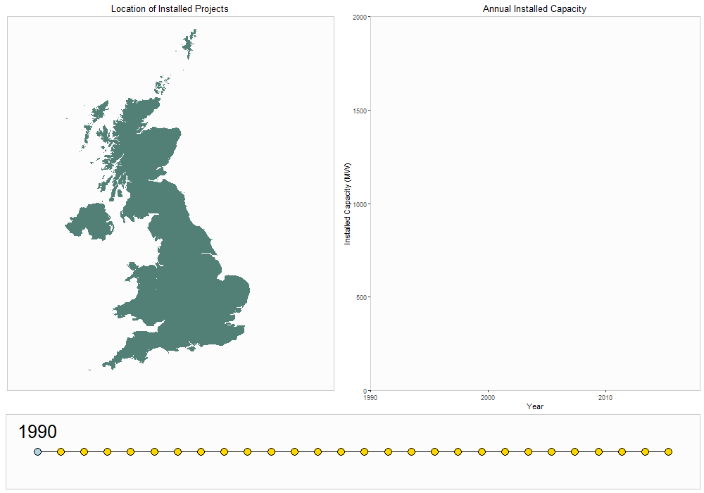
Smoother Animation
A problem with the animation package is that the transitions are not very smooth between the points. If you are looking for a more delicate transition, the tweenr package (available here) may be a good option. Essentially, the package interpolates your dataset, adding extra values between each of your specified frames, which enables a smoother transition.
An example of this package is beyond the scope of this article, but you may want to check out the examples on the GitHub page, or alternatively this blog provides some cool examples.
The new gganimate
I was very pleased to see the author of many fantastic R packages, Thomas Lin Pedersen, is working on a revised version of gganimate. This will make it easier to create animated plots with smooth transitions, without the need to use Tweenr. You should follow the package development on GitHub: https://github.com/thomasp85/gganimate, and check out Twitter for some great examples of how it can be used: https://twitter.com/thomasp85
Conclusion
I hope you found the post useful, and that it provides some inspiration for data visulations of your own!
If you are interested in reproducing the examples yourself, check out my GitHub for the full code used to make this post.