There is a lot of emphasis on getting real-time data for COVID-19, and the NHS, ONS and other organisations have been pretty great at making this available. But as with any real-time datasets, there can be caveats around how to interpet them.
This post aims to give a brief overview of the data, providing some real examples of what it represents, and mostly importantly, explains how to interpret them correctly.
If you are interested in the underlying code, make sure to check out the source code for all this on GitHub here.
The data
The main dataset people refer to comes from the NHS here. They provide two datasets:
- A summary of total deaths since the start of the pandemic
- a Daily Update
Most the attention goes on the daily updates. As noted in the documentation:
“The Daily file contains only deaths from the latest reporting period, 4pm 2 days prior to publication until 4pm the day before publication. The Total file contains all reported deaths.”
Now, probably the potentially confusing aspect is that there are technically two dates which can used for recording deaths:
- The day the death happened
- The day the death was recorded
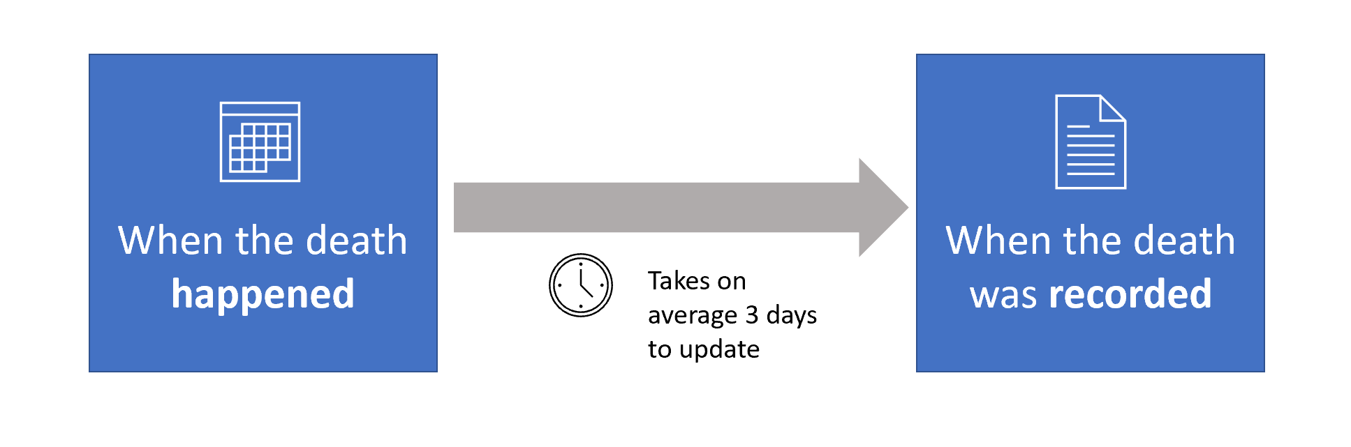
When you think about this, it makes sense, as it is impossible for the system to be updated instantly. This process takes typically around 3 days for the UK, although as I show later, can take significantly longer.
For this example, I will show what both of these datasets mean.
The basics
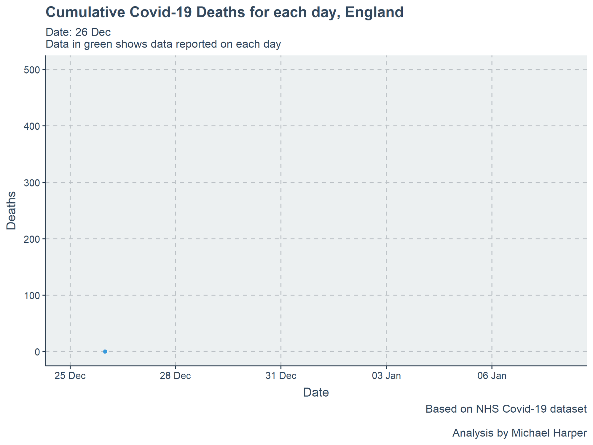
So, before we dive into the full dataset, lets first look at a single day. For this example I have selected 2nd January 2021. This presents it as it comes directly from the CSV:
As you’ll see from the table, the data gives us a column for each day, with each row providing the deaths for a region. This table provides us with the date of death for all deaths registered on the 2nd. So for example, on the 2nd January, there were a total of 383 deaths in England. Of these, there were 157 deaths reported which happened on 31st December. Finally, you will note that there are some deaths which happened back in November which were also just reported! The graph below provides a representation of this data.

So, we have the basics of one day. Now lets compare a day a few days later: 5th January. The total number of deaths reported is 674, and again the plot helps show a similar pattern. But if we compare the two spreadsheets, you’ll notice that the values have dropped for some days. For example, on the 31st of December, the previous data showed 157 deaths occured, while this only shows 29 deaths. So what is going on?

Well, it is important to remember that the data for each day only records the deaths which happened in the last 24 hours. It is not cumulative. If we want to see the total deaths, we need to refer to “Total Deaths Spreadsheet”, which records the date of death, not the date it was recorded. This can be demonstrated visually below:
The plot below shows how the data adds up. Each day, the new NHS death records are added, and as shown previously, these can go back days, weeks and potentially months.
Delay of Deaths being reported
As mentioned earlier, deaths can be delayed getting reported. The impact of this can be that there appears to be a temporary drop in deaths, even if deaths have been rising. The graph below shows the distribution of deaths recorded. The majority do get reported in the first two days, but it can be expected that it takes around a week until it is getting close to the full number.

Got any questions?
There is a lot of information and data being made available, making it hard to know what to trust! Over the next few weeks, I will be continuing to explore some of these and hopefully providing data which can remove the confusion. As below, let me know if you have anything you want looking into!
If you see anything you want questioning on COVID and want a second opinion, feel free to tag me. I'm not a virologist, but have a good understanding of statistics to provide what I feel is a balanced opinion to reviewing scientific research. #COVID19 #lockdown2021
— Michael Harper (@DrMichaelHarper) January 6, 2021
If this article has helped at all, it would mean a lot if you can like and share!