About
I have reflecting on the unprecedented week in the UK. Even this time last week, the country seemed fairly laid back as government advice was largely to continue with business as usual. It is all very different to now, with schools set to close on Monday and most people either working from home or not working at all.
This blog post provides details of anaylsis and data viusalisation to assess the spread of virus, giving three example maps which I have produced. Like usual, it is aimed at a technical audience of data visualisation people who want to understand how to make R graphs! Hopefully it provides an example of how you may be able to use the gganimate (Pedersen and Robinson 2020) package to produce data visualisations.
Setup
The following packages are used. Note, we are using the ggthemr (Tobin 2020) which is not avaialable on CRAN, so you will need to install that if you haven’t already got it.
# Load packages
library(readr)
library(tidyverse)
library(sf)
library(maps)
library(gganimate)
library(ggthemr)
library(magick) # For combining gifs
library(patchwork)

# devtools::install_github('cttobin/ggthemr')
ggthemr("light")
Data Loading and Preparation
As in my previous analysis, I’ll be using the John hopkins dataset.As a reminder, the data can be accessed through the GitHub repository here, and they also offer a great dashboard for visualising the data here.
I’ll conduct some data cleaning to make the data usable for graphing. For those familiar with the tidyverse in R, most functions prefer to have data in long format. One thing I have added since the original code is a name correction dictionary. The purpose of this is to resolve differences between the datasets which were creating issues when joining the data. For example, some datasets had United States while other had US. The recode function is used throughout the example referring to the following list:
# Resolves inconsistencies between naming in data sources
# Not all datasets have inconsistences but set here and applied to all
countryNameDict <- c("Czech Republic" = "Czechia",
                     "United Kingdom" = "UK",
                     "Bosnia Herzegovina" = "Bosnia and Herzegovina",
                     "Iran, Islamic Rep." = "Iran",
                     "Macedonia" = "North Macedonia",
                     "United States" = "US",
                     "Russian Federation" = "Russia",
                     "Dem. Rep. Korea" = "North Korea",
                     "Congo (Kinshasa)" = "DRC",
                     "Democratic Republic of the Congo" = "DRC",
                     "Congo (Brazzaville)" = "Congo",
                     "Republic of the Congo" = "Congo",
                     "Côte d'Ivoire" = "Cote d'Ivoire")
This function is run below to load the three files into a single dataset:
# Function clean data for each of the files and aggregate
dataToLong <- function(df, var){

  # Convert to long data
  dataLong <-
    df %>%
    tidyr::gather(key = "date", "cases", -c("Province/State",  "Country/Region", "Lat", "Long"))

  # Aggregate to only have a single region per country
  df_all <-
    dataLong %>%
    set_names(c("province", "region", "lat", "long", "date", "value")) %>%
    group_by(region, date) %>%
    summarise(value = sum(value)) %>%
    ungroup() %>%
    mutate(date = lubridate::parse_date_time(date, "%m%d%y"),
           region = recode(region, !!!countryNameDict),
           type = var)

  return(df_all)
}

# Run function on data and merge
df_cases <- dataToLong(df_cases, "cases")
df_deaths <- dataToLong(df_deaths, "deaths")
df_recovered <- dataToLong(df_recovered, "recovered")

# Combine data
df_all <- bind_rows(df_cases, df_deaths, df_recovered)
I wanted the analysis to remain static so that it matches the day of this post. I therefore added in a data filter to the 19th March below:
# Fix date to date article was produced. This could be removed to keep the map updating
df_all <-
  df_all %>%
  filter(date <= "2020-03-20 UTC")
To visualise the data, I will load a global national boundary spatial datasets using the spData (Bivand, Nowosad, and Lovelace 2019) package. I also load some additional population data which is useful if you want to normalise the calculations:
# Load global boundaries
world_map <-
  spData::world %>%
  st_as_sf() %>%
  select(name_long, continent) %>%
  rename("region" = "name_long") %>%
  filter(region != "Antarctica") %>%
  mutate(region = recode(region, !!!countryNameDict))

# World bank population estimates
pop <- read_csv("../2020-03-17-Covid/API_SP.POP.TOTL_DS2_en_csv_v2_866861.csv") %>%
  select(c("Country Name", "2018")) %>%
  set_names("region", "pop") %>%
  mutate(pop = pop/10^6,
         region = recode(region, !!!countryNameDict))

# Merge data with shapefile
# Normalise rates
df_all_spatial <-
  world_map %>%
  left_join(df_all) %>%
  left_join(pop) %>%
  mutate(value = replace_na(value, 0),
         casespermillion = value/pop) %>%
  arrange(region, date)
Producing the plots
There are two components to the plot:
- The map itself
- A timeline bar which shows the progress along the bottom
Using the gganimate package, you need to produce these two separately then merge the results. First we will prep the data for the plot and then produce the base ggplot which we will animate afterwards. Note, there are a few workarounds in the following cocde. First I am finding the earlier date for each region that there was a a reported case:
# Extracts the first cases
df_firstcase <-
  df_all_spatial %>%
  filter(type == "cases") %>%
  group_by(region) %>%
  filter(value > 0) %>%
  filter(date == min(date, na.rm = T)) %>%
  ungroup()
Next we convert the spatial data from a spatial feature into a slightly old-fashioned format for doing spatial data in ggplot using the fortify function. I would typically use the geom_sf option but this is not yet fully supported by gganimate.
# Convert geometry to format to allow to work with gganimate
# gganiamte currently doesn't support sf
df_firstcase_sp <-
  df_firstcase %>%
  as("Spatial")

d <- merge(fortify(df_firstcase_sp), as.data.frame(df_firstcase_sp), by.x="id", by.y=0)
I want the graph to display a frame for every date, even if there is no change in the countries which are reporting infection. I therefore created a placeholder dataframe which had the same format as the spatial data above, but only gave a date value. This will trick gganimate into thinking there is data to display for every slide.
# Create a placeholder dataframe which has every date in a sequence
# This is used to force gganimate to display every single day even if there is no change
# in the data
allDays <-seq(from = min(d$date), to = max(d$date), by = lubridate::ddays(1))

allDaysDf <- data.frame("id" = NA,
                        "long" = NA,
                        "lat" = NA,
                        "order" = NA,
                        "hole" = NA,
                        "piece"  = NA,
                        "group" = "extra",
                        "region" = NA,
                        "continent" = NA,
                        "date" = allDays,
                        "value" = NA,
                        "type" = NA,
                        "pop" = NA,
                        "casespermillion" = NA)

f <- bind_rows(d, allDaysDf)
Finally I will build the ggplot. First I specify just the raw components, with nothing different for the animation yet:
# Make the plot
plot_map <-
ggplot(d) +
geom_sf(data = world_map, fill = "grey90", colour = "#dadada") +
geom_polygon(aes(x = long, y = lat, group = group), fill = "#3a6589") +
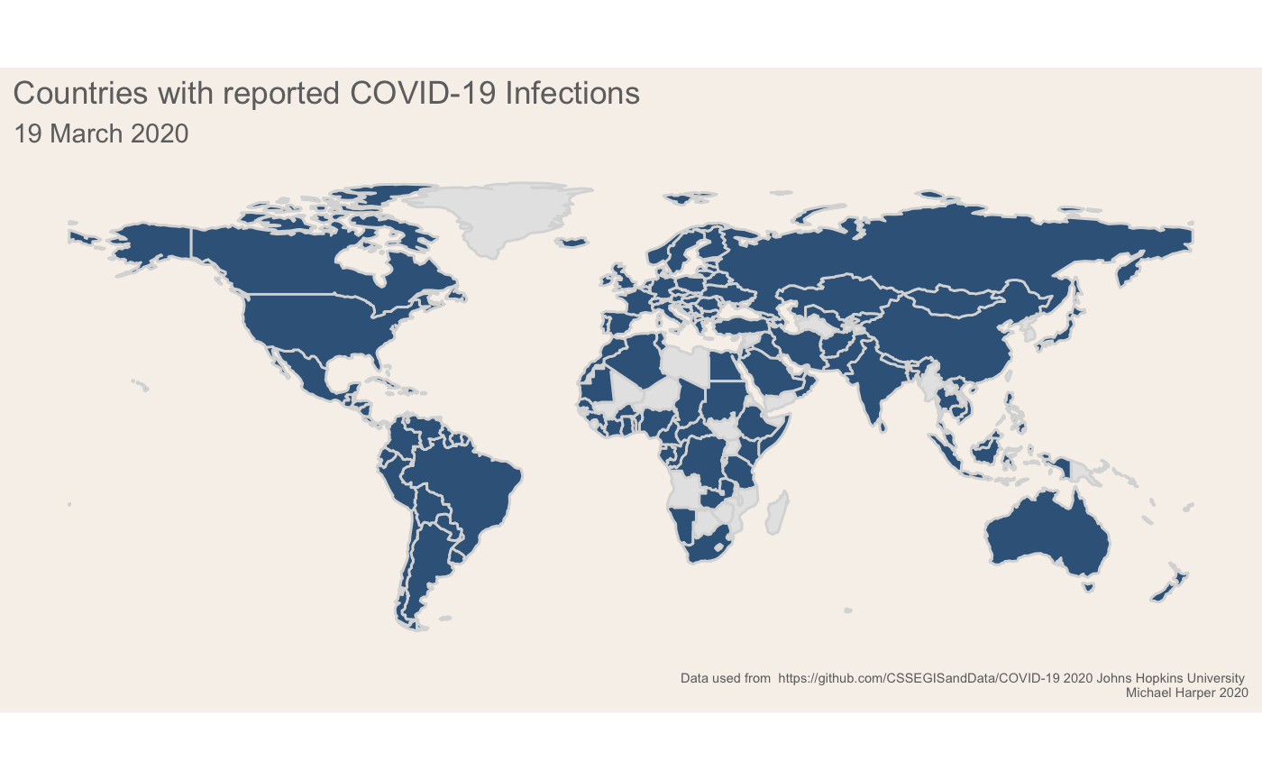
labs(title = "Countries with reported Covid-19 Cases") +
theme(plot.caption = element_text(size = rel(0.5)),
plot.background = element_rect(fill = '#f6f1eb', colour = NA),
panel.background = element_blank(),
axis.text = element_blank(),
axis.ticks = element_blank(),
axis.line = element_blank(),
axis.title = element_blank(),
panel.grid = element_blank(),
legend.background = element_blank(),
title = element_text(colour = '#706f6f', size = rel(2), hjust = 0.5),
plot.title = element_text(colour = '#706f6f', size = rel(1.5), hjust = 0.5),
legend.position = "none")If you are new to gganimate, it offers a fairly user-friendly way of animating plots. We can take our base ggplot object above and add transition_states which will progressively go through the dates and show data for each date. I had initially wanted to use transition_reveal, but I couldn’t find a way to make these smoothly animate data as they were added to the graph as it doesn’t seem to accept any of the transition aes arguments. As a slight work around to make transition_states work, I used the shadow_mark to make the data remain on the map:
nframesAnim <- length(allDays) * 5
durationAnim <- 15

plot_anim <- plot_map +
  transition_states(date, wrap = F) +
  enter_recolor(fill = "#f0f5f9") +
  shadow_mark(past = T, alpha = 1, fill = "#3a6589")

# Render the map
gif1 <- animate(plot = plot_anim,
                height = 768,
                width =1800,
                nframes = nframesAnim,
                duration = durationAnim,
                end_pause = 10)
We will also produce the timeline below the plot:
# Select first and last date to interpolate between
# For some reason this is smoother than letting gganimate do every single point
g <- allDaysDf[c(1,nrow(allDaysDf)),]

plot_timeline <-
  ggplot(g, aes(x = date, y = 1)) +
  geom_point(aes(group = 1L), size = 5) +
  scale_x_datetime(date_labels = "%b %d", date_breaks = "1 week") +
  labs(caption = "Data used from  https://github.com/CSSEGISandData/Covid-19 2020 Johns Hopkins University \nData Visulation by Michael Harper 2020 www.mikeyharper.uk") +
  theme(aspect.ratio = 0.025,
        legend.position = "none",
        axis.text.y = element_blank(),
        axis.text.x = element_text(size = rel(3)),
        axis.title = element_blank(),
        axis.line.y = element_blank(),
        axis.ticks = element_blank(),
        axis.line.x = element_blank(),
        panel.grid = element_blank(),
        panel.grid.major.x = element_line(size = 2, linetype = "solid"),
        plot.background = element_rect(fill = '#f6f1eb', colour = "#f6f1eb"),
        plot.margin = margin(1, 2, 0, 2, "cm"),
        panel.background = element_rect(fill = '#e3dfda', colour = NA))

gif2 <- animate(
  plot_timeline +
    transition_states(date,
                      transition_length = 1,
                      state_length = 0,
                      wrap = F),
  width =1800, height = 130, nframes = nframesAnim, duration = durationAnim, end_pause = 10, rewind = F
)
gif2
gganimate does not natively support plotting multiple plots together, however it is very easy to achieve this using the magick package. A demo is given in the wiki here.
a_mgif <- image_read(gif1)
b_mgif <- image_read(gif2)
new_gif <- image_append(c(a_mgif[1], b_mgif[1]), stack = T)
for(i in 2:nframesAnim){
combined <- image_append(c(a_mgif[i], b_mgif[i]), stack = T)
new_gif <- c(new_gif, combined)
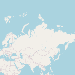
}We can visualise the final gif below!
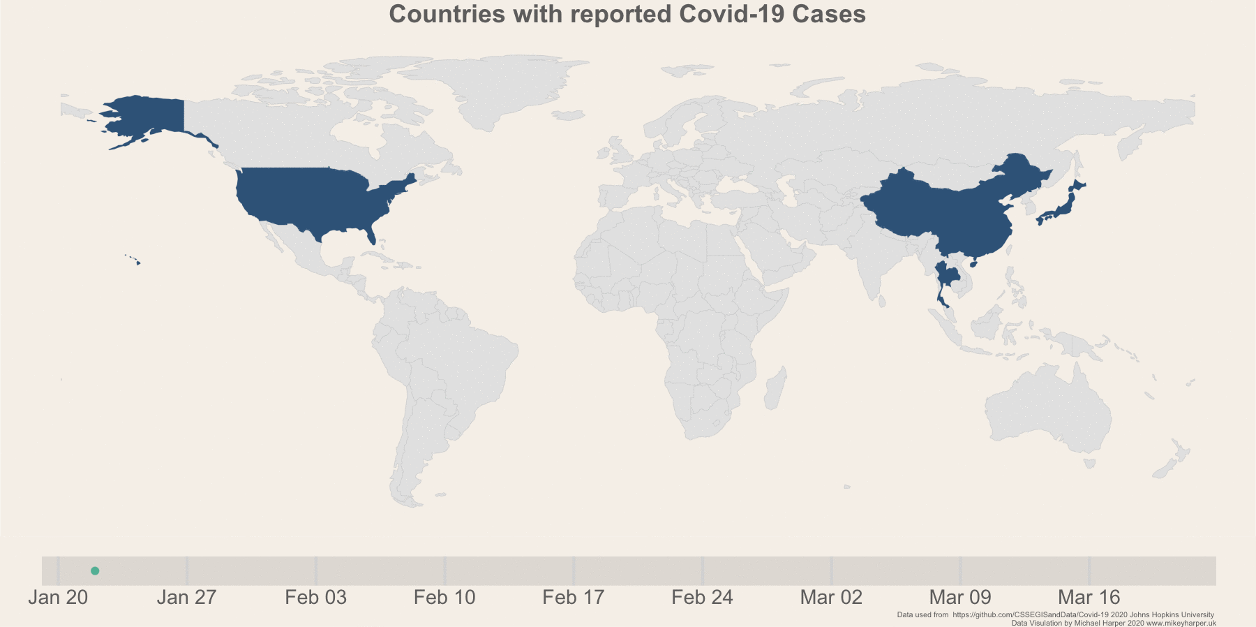
Figure 1: Finalised plot showing the change in infection rates
Today Cases
As a second data exploration, I just wanted to produce a static map of the current death totals per country, and then to highlight the top 10 countries. The following code creates Figure 2. In these plots, I am using the patchwork (Pedersen 2019) package to combine the two ggplot objects into a single plot:
# Select the current day
deathsToday <-
  df_all_spatial %>%
  filter(type == "deaths") %>%
  group_by(region) %>%
  filter(date == max(date, na.rm = T)) %>%
  ungroup() %>%
  filter(value > 0)

# Make colour scale
labels <- c("0 - 10", "10 - 100", "100-500", "500-1000", "1000+")
deathsToday$cut <- cut(deathsToday$value, c(0,10,100,500,1000,Inf), labels = labels)

# Globabl
p1 <- deathsToday %>%
  ggplot() +
  geom_sf(data = world_map, fill = "grey90", colour = "white", size = 0.1) +
  geom_sf(aes(fill = cut), colour = "black", size = 0.1) +
  scale_fill_manual(values = c("#F2DFDC", "#E5C0B9", "#D8A197", "#CB8174", "#BE6251", "#B2432F")) +
  labs(fill = "Deaths") +
  theme(plot.caption = element_text(size = rel(0.5)),
        panel.background = element_rect(fill = "#f6f1eb"),
        plot.background = element_rect(colour = "#f6f1eb"),
        axis.line = element_blank(),
        axis.text = element_blank(),
        axis.ticks = element_blank(),
        axis.title = element_blank(),
        legend.position = c(0.1, 0.2),
        legend.background = element_blank(),
        panel.grid = element_blank())

p2 <-
  deathsToday %>%
  top_n(n = 10, wt = value) %>%
  ggplot(aes(x = reorder(region, value), y = value, fill = cut)) +
  geom_col(colour = "#706f6f") +
  scale_fill_manual(values = c("#F2DFDC", "#E5C0B9", "#D8A197", "#CB8174", "#BE6251", "#B2432F")) +
  coord_flip() +
  labs(y = "Deaths",
       x = "Country",
       fill = "Continent",
       caption = "Data used from  https://github.com/CSSEGISandData/Covid-19 2020 Johns Hopkins University") +
  theme(panel.grid.major.y = element_blank(),
        legend.position = "none",
        axis.title.y = element_blank(),
        plot.background = element_rect(colour = "#f6f1eb"),
        aspect.ratio = 1.5)


p1 + p2 + plot_layout(widths = c(3.5, 1)) +
  plot_annotation(title = glue::glue("Covid-19 Deaths as of {date}", date = format(max(deathsToday$date), "%d %B")),
                  subtitle = glue::glue("Total deaths recorded: {deaths}", deaths = sum(deathsToday$value, na.rm = T))) & theme(plot.background = element_rect(fill = "#f6f1eb"))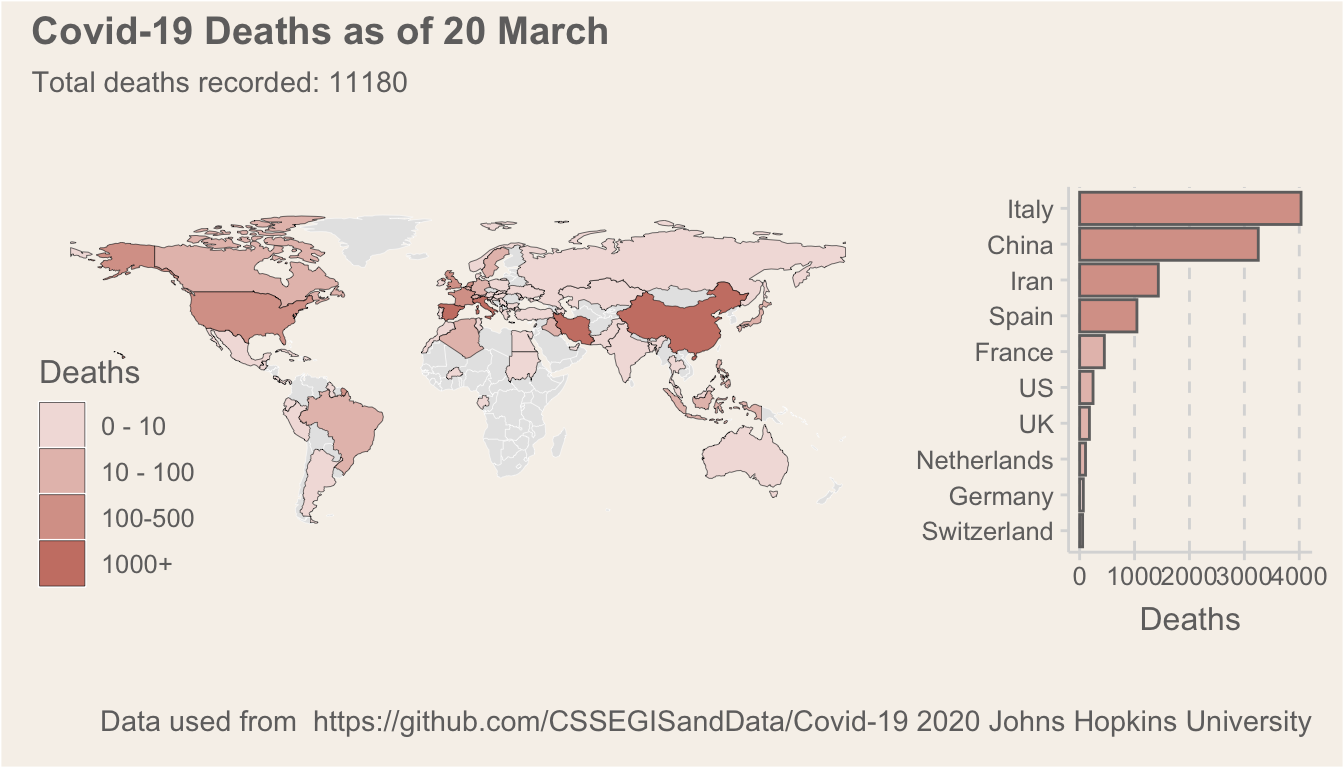
Figure 2: A summary of deaths per country
Interactive Maps
Using leaflet (Cheng, Karambelkar, and Xie 2018) we can produce an interactive map showing the number of cases per country. If you haven’t used the leaflet R package before, it offers an interface to the Javascript library and you can quite easily build complex visualisations with it. It is definitely my preffered interactive map package for R, even if it takes a little bit more time to master than alternatives like tmap.
library(leaflet)

# Build colour palette
bins <- c(0,10,100,500,1000,Inf)
pal <- colorBin("YlOrRd", domain = deathsToday$value, bins = bins)

# Create the labels displayed in the popups
labels <- sprintf(
  "<strong>%s</strong><br/>Deaths: %g",
  deathsToday$region, deathsToday$value
) %>% lapply(htmltools::HTML)

# Build the leaflet map
leaflet(deathsToday) %>%
  addTiles() %>%
  addPolygons(data = world_map,
              fillColor = "grey",
              color = "white") %>%
  leaflet::setMaxBounds(-90, -90, 90, 90) %>%

  addLegend("bottomleft", pal = pal, values = ~value,
            title = "Number of Deaths",
            labFormat = labelFormat(),
            opacity = 1
  )    %>%
  addPolygons(
    fillColor = ~pal(value),
    weight = 2,
    opacity = 1,
    color = "white",
    dashArray = "1",
    fillOpacity = 0.7,
    highlight = highlightOptions(
      weight = 5,
      color = "#666",
      dashArray = "",
      fillOpacity = 0.7,
      bringToFront = TRUE),
    label = labels,
    labelOptions = labelOptions(
      style = list("font-weight" = "normal", padding = "3px 8px"),
      textsize = "15px",
      direction = "auto"))
10 – 100
100 – 500
500 – 1,000
1,000 – Inf
Conclusion
As always, I hope this blog is informative and gives some ideas on how you may want to use R. If you have any questions, please feel free to ask in the comments and I will try and get back to you!
Bibliography
Bivand, Roger, Jakub Nowosad, and Robin Lovelace. 2019. SpData: Datasets for Spatial Analysis. https://CRAN.R-project.org/package=spData.
Cheng, Joe, Bhaskar Karambelkar, and Yihui Xie. 2018. Leaflet: Create Interactive Web Maps with the Javascript ’Leaflet’ Library. https://CRAN.R-project.org/package=leaflet.
Pedersen, Thomas Lin. 2019. Patchwork: The Composer of Plots.
Pedersen, Thomas Lin, and David Robinson. 2020. Gganimate: A Grammar of Animated Graphics. https://CRAN.R-project.org/package=gganimate.
Tobin, Ciaran. 2020. Ggthemr: Themes for Ggplot2.