COVID-19 Preliminary Data Analysis
As a data analyst, I always get happy when I discover there are great datasets available for interesting and important global events. I make a lot of my own decision making through data, and therefore this data gives me a way to cut through all the media noise which can often be present. This is certainly the case with the COVID-19 outbreak which is currently sweeping the UK media!
This blog post provides a combination of the code and interpretation on some analysis of global COVID-19 rates. I appreciate this might limit the appeal to both programmers (who probably only want to the code) and the general public (who definitely don’t care about the code and only want the graphs), however the whole idea of having a blog is that I can share rough-and-ready content. If I aim for perfection, it could likely be another year before I actually post anything.
Data
For the analysis, I am using the COVID-19 dataset produced by John Hopkins University. They provide a daily updating dataset at a national level, highlighting the cases, recoveries and deaths associated with the virus. The data can be accessed through the GitHub repository here, and they also offer a great dashboard for visualising the data here.
There are three separate files for different records:
# Using the John hopkins dataset which updates dailydf_cases <- read_csv("https://raw.githubusercontent.com/CSSEGISandData/COVID-19/master/csse_covid_19_data/csse_covid_19_time_series/time_series_19-covid-Confirmed.csv")
df_deaths <- read_csv("https://raw.githubusercontent.com/CSSEGISandData/COVID-19/master/csse_covid_19_data/csse_covid_19_time_series/time_series_19-covid-Deaths.csv")
df_recovered <- read_csv("https://raw.githubusercontent.com/CSSEGISandData/COVID-19/master/csse_covid_19_data/csse_covid_19_time_series/time_series_19-covid-Recovered.csv")
I’ll conduct some data cleaning to make the data usable for graphing. For those familiar with the tidyverse in R, most functions prefer to have data in long format.
# Function to preprocess datadataToLong <- function(df, var){
  df_all <-    df %>%    tidyr::gather(key = "date", "cases", -c("Province/State",  "Country/Region", "Lat", "Long")) %>%    set_names(c("province", "region", "lat", "long", "date", "value")) %>%    group_by(region, date) %>%    summarise(value = sum(value)) %>%    ungroup() %>%    mutate(date = lubridate::parse_date_time(date, "%m%d%y"),           region = recode(region, "United Kingdom" = "UK"),           type = var)  return(df_all)}
# Apply function across three CSVsdf_cases <- dataToLong(df_cases, "cases")df_deaths <- dataToLong(df_deaths, "deaths")df_recovered <- dataToLong(df_recovered, "recovered")
# Combine datadf_all <- bind_rows(df_cases, df_deaths, df_recovered)
Some additional metrics are calculated from the raw data:
rate of change: how many new cases have there been since the day before and 7 days previouscases per million people: to enable comparison, data is normalised by dividing the number of cases by the total national population. This population is based on the WorldBank estimates.days Since outbreakcalculates how long it has been since the first reported case in a country
# calculate when the first reported case wasfirstOutbreak <-  df_cases %>%  filter(value != 0) %>%  group_by(region) %>%  filter(date == min(date)) %>%  mutate(firstOutbreak = date) %>%  select(-c(date, value))
first200Outbreak <-  df_cases %>%  filter(value > 200) %>%  group_by(region) %>%  filter(date == min(date)) %>%  mutate(first200Outbreak = date) %>%  select(-c(date, value))
# Calculate additional metrics such as rate of contagiondf_cases_extra <-  df_cases %>%  left_join(firstOutbreak) %>%  left_join(first200Outbreak) %>%  group_by(region) %>%  mutate(changeDaily = value - lag(value, n = 1),         changeWeekly = value - lag(value, n = 7),         dailypercChange = changeDaily/value,         weeklypercChange = changeWeekly/value,         daysSinceOutbreak = as.numeric(date - firstOutbreak)/86400,         daysSince200Outbreak = as.numeric(date - first200Outbreak)/86400)
Although not yet used in this analysis, it is my intention to introduce some spatial components into the modelling. I therefore load a global shapefile for all the boundaries:
# Load global boundariesworld_map <-  spData::world %>%  st_as_sf() %>%  select(name_long, continent) %>%  rename("region" = "name_long") %>%  filter(region != "Antarctica") %>%  mutate(region = recode(region, "United Kingdom" = "UK"))
# World bank population estimatespop <- read_csv("API_SP.POP.TOTL_DS2_en_csv_v2_866861.csv") %>%  select(c("Country Name", "2018")) %>%  set_names("region", "pop") %>%  mutate(pop = pop/10^6,         region = recode(region,                         "United Kingdom" = "UK",                         "Iran, Islamic Rep." = "Iran"))
# Merge data with shapefile# Normalise ratesdf_all_spatial <-  world_map %>%  left_join(df_all) %>%  left_join(pop) %>%  mutate(value = replace_na(value, 0),         casespermillion = value/pop) %>%  arrange(region, date)
Exploring contagion rates
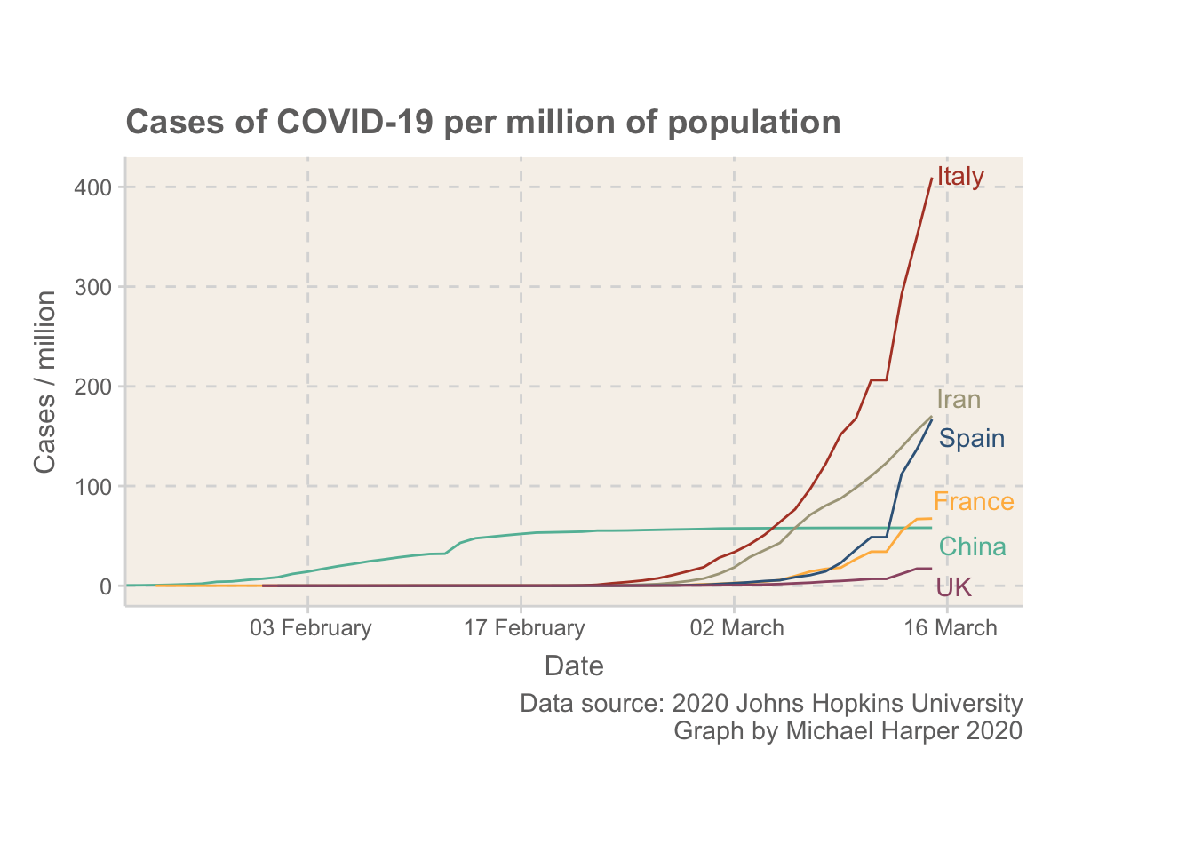
Media attention has been focussing on several countries, primarly, China, Italy, Iran, Spain. As I live in the UK, this will be compared.
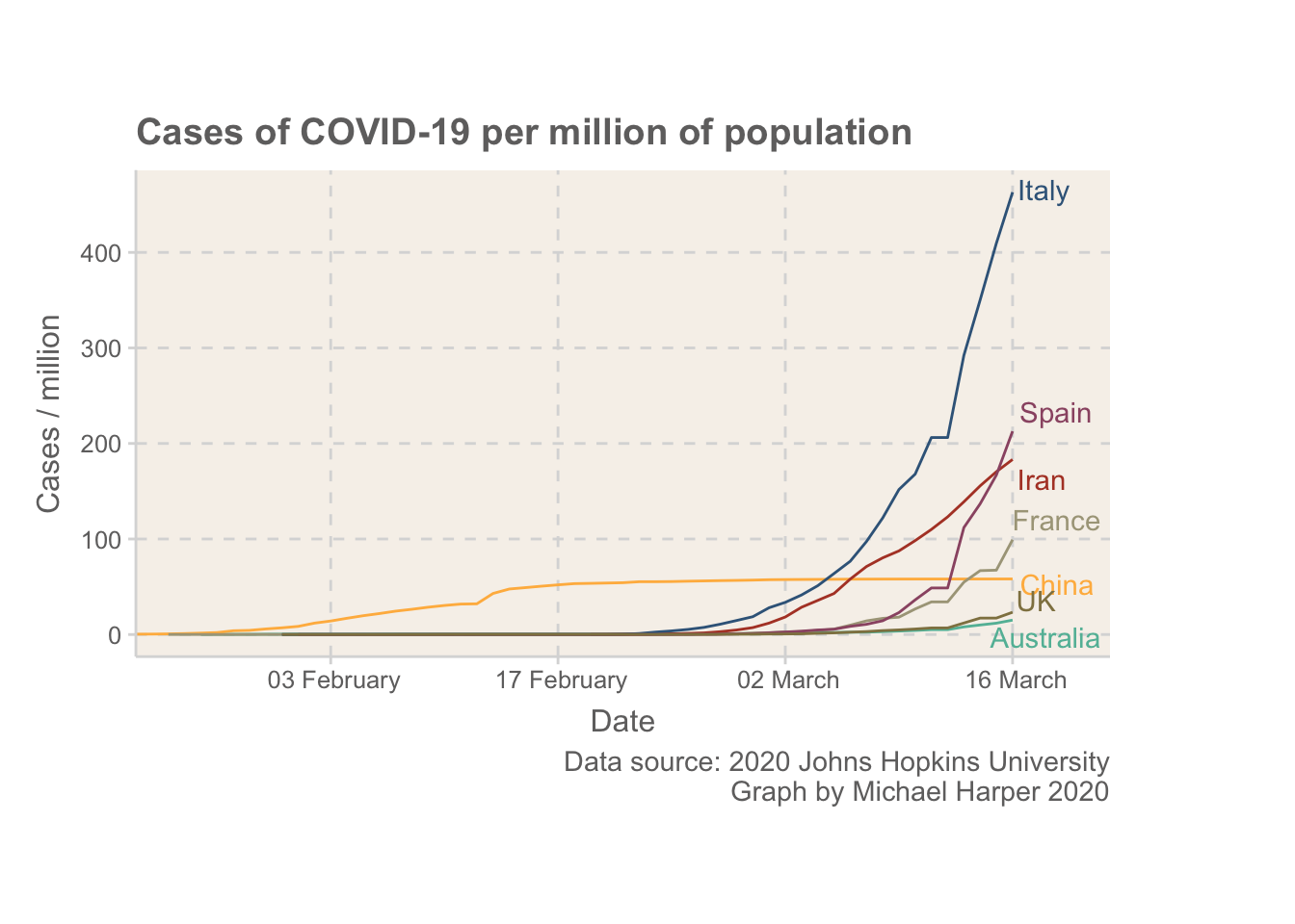
Now, the intention of this blog is not to provide an extensive analysis, but I wanted to add some reflections. Firstly, I think it is important to first note that the UK is in a more fortunate position than some other European countries. The rate of COVID-19 is still at a relatively low level. By the time Italy was expanding their quarantine to cover all of Italy on 8th March, they were already well above where the UK is.
The UK seems to have taken really big steps today, but I hope the public don’t overlook the virus based on how low the rates currently are. The whole idea of containing something like this is that it is much easier to keep under control if only a small percentage of people have it. Once rates increase even the most severe measures won’t be able to help us protect the most vulnerable in society.
Ranking countries
A large part of why countries have been considered hotspots is just down to how early the infection got to them. It’s interesting to compare countries from the same starting point, so this looks at how quickly things escalate after there are 200 reported cases.
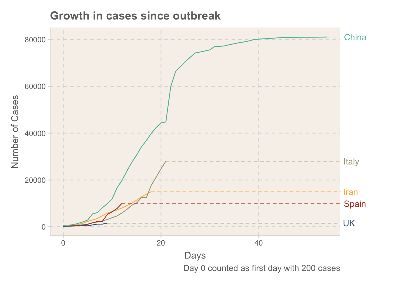
It’s not too surprising that China being the first country to experience the outbreak has so far seen the quickest increases, given they didn’t really know what they were dealing with. Spain, Iran and Italy all currently seem to be following a similar exponential trajectory. The UK is still relatively early on to see how fast it will increase, but given the escalation in measures put in place so far it seems likely that this will be lower. Will have to wait and see.
It is also interesting to see how China have been able to really control the outbreak. New cases have levelled off, although they have been using ethically questionable methods to achieve these levels (such as tracking the locations of every citizen)
Outbreaks vs rates of infection
The final plot explores the rate of infection compared to the proportion of the popualation infected. I think the media tend to report headline figures which count in people more than rates. “20000 people infected” definitely is more intimidating than “400 people in a million are potentially infected”.
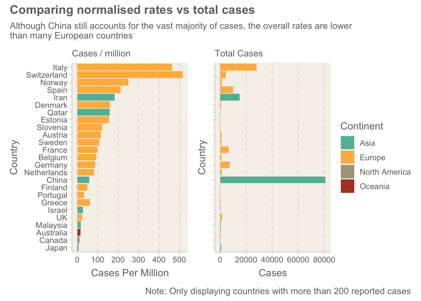
Europe has some surprisingly high levels of the virus. Some of the media have been referring to Europe as the COVID-19 hotspot, but having looked at the data, I can’t help but feel that large parts of the world are just not collecting data with the same level of accuracy. This graph shows how most of the highest-ranking countries are in Europe. The US is a prime example where real numbers are predicted to be much higher than the official stats!
It is interesting seeing some of the smaller European countries high up the list. At this stage of the outbreak, where there are still relatively controlled cases, these small cases are more likely to represent outliers. Time will tell how these change.
Conclusion
I hope that if you came here looking for code, that you feel satisfied, and if you wanted some half-baked discussion of the results, you are equally happy! This is definitely the start of several graphs, and I really want to look into some of the spatial aspects of the data.
Please comment if you have any ideas or questions!