UK goes into lockdown: further Covid-19 analysis
On 23rd March, the UK introduced unprecedent measures to lockdown the country in the wake of the continuing Covid-19 outbreak. This followed a week of slowly escalating measures all designed to increase the amount of social distancing and reduce the spread of the virus. This article dives into some of the statistics available for this week and provide some more context for readers going further into the crisis.
I reiterate my previous comments than I am not an epidimologist, but someone with an interest in data. My aim is to understand data and to reach an informed opinion.
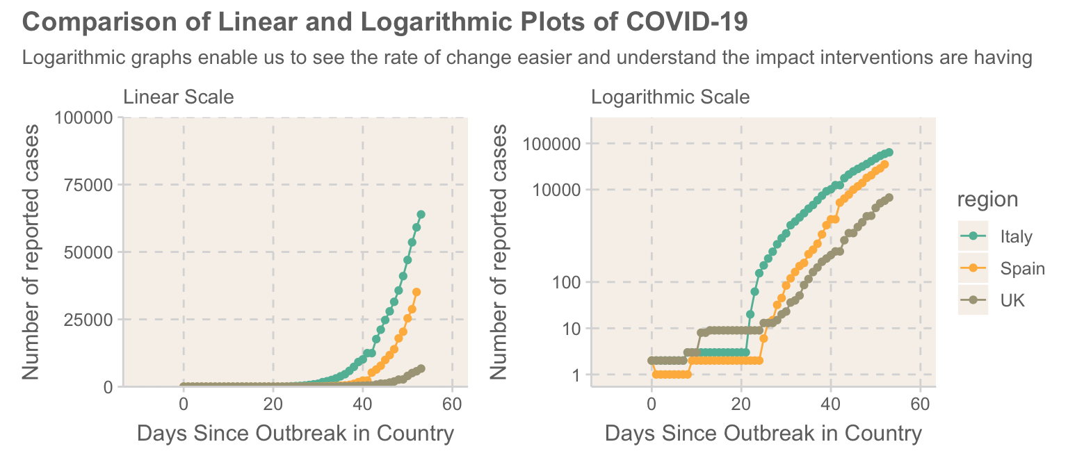
The Problem With Linear Graphs
To most of the world, the rise of Covid-19 has come as a massive surpise. One of the big challenges people have had in communicating the risk of Covid-19 is that it has been raising exponentially. “Why should we worry about this when it is so small?”, people have been saying. Even at the stage where the UK is now, where we have experienced 336 deaths, it is difficult to tell how whether we are on the same trajectory as countries such as Spain or Italy, which are recording 2311 and 6077 respectively. As a result, it is easy to downplay the threat, and as can be still clearly seen, many people are not taking the warnings from the government seriously. Humans tend to be really bad at thinking about exponential changes (ask any person in their 20s how much they are putting into their pension).
In situations like this where we are dealing with a exponential growth, logarithmic plots enable us to easily visualise the rate of change much easier. Plotted on this, we transform the exponential curve into a straight line. If the line gets steeper, it means the virus is spreading quicker, while reducing the gradient shows that the virus is getting under control. The graph below shows a comparison of a linear and logarithmic plot of the same data. On a linear scale, the UK is still far behind the levels of Italy, however the logarithmic plot reveals that rates of growth in the UK are occuring at a similar rate to those in Italy. It is also possible to see that the rate at which new infections are being recorded in Italy are starting to decrease, potentially a useful indicator that the national lockdown is starting to take effect.
The UK’s trajectory
Now that I have done my explaining logarithmic plots, we can dive into the proper analysis. As has been widely noted, there are vast differences between the ways in which countries are testing for Covid-19, with countries like the UK currently only routinely people in hoispital. However, the UK does plan to increase tests to 25,000 a day within 4 weeks.
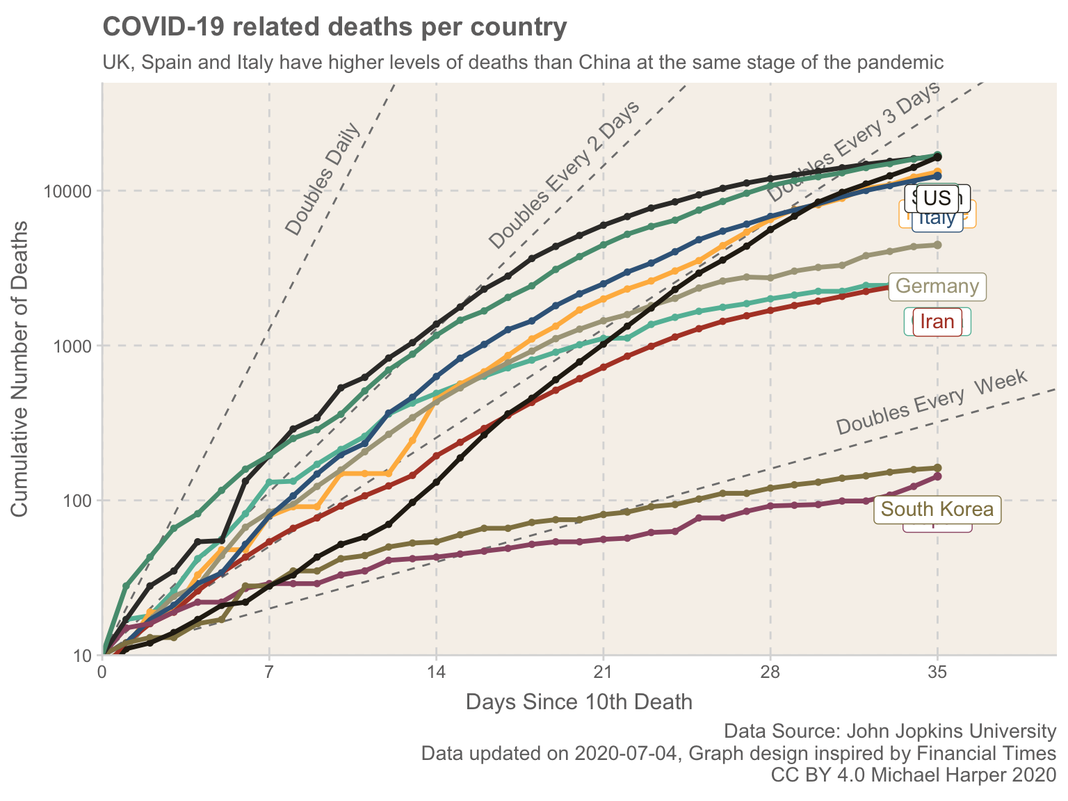
To get a more accurate international comparison, the number of deaths provide us an easier metric. The graph below compares the numbers of deaths in key countries. It highlights how the UK, Spain and Italy are all on trajectories higher than what China was at a similar stage of the outbreak of Covid-19, and deaths in the UK have been doubling every two days. It can be expected that as countries ramp up their social distancing methods, that we can expect a consequent reduction of infections and resulting in a slowdown of deaths, something which appears to be beginning in Italy.
It is interesting to see how both Japan and South Korea have been able to keep the rates lower, approximately doubling each week. It has been noted that South Korea have been particularly effective at testing and containing the spread of Covid-19, operating 600 testing centres across the country, then tracking any identified positive infections.
The following graph allows us to see the relative performance of more countries. Note, the plot uses number of cases as there is still not a fully available dataset for deaths, especially for countries which have recently experience outbreaks. We can clearly see that many countries are following the same trajectory as Italy, which provides cause for concern.
Note, I have used the absolute values within the plot, not adjusting for population. This has been hotly debated in many countries, namely the US where critics of the idea of imposing a lockdown point at US having a much larger population than countries like Italy, therefore in reality the problem is much smaller. However, as noted by John Burn-Murdoch: “Normalised numbers are good at showing relatively how much strain a country is under, but they’re unsuited to tracking the extent/state of a country’s outbreak, which spreads at ~same pace regardless of country size.”
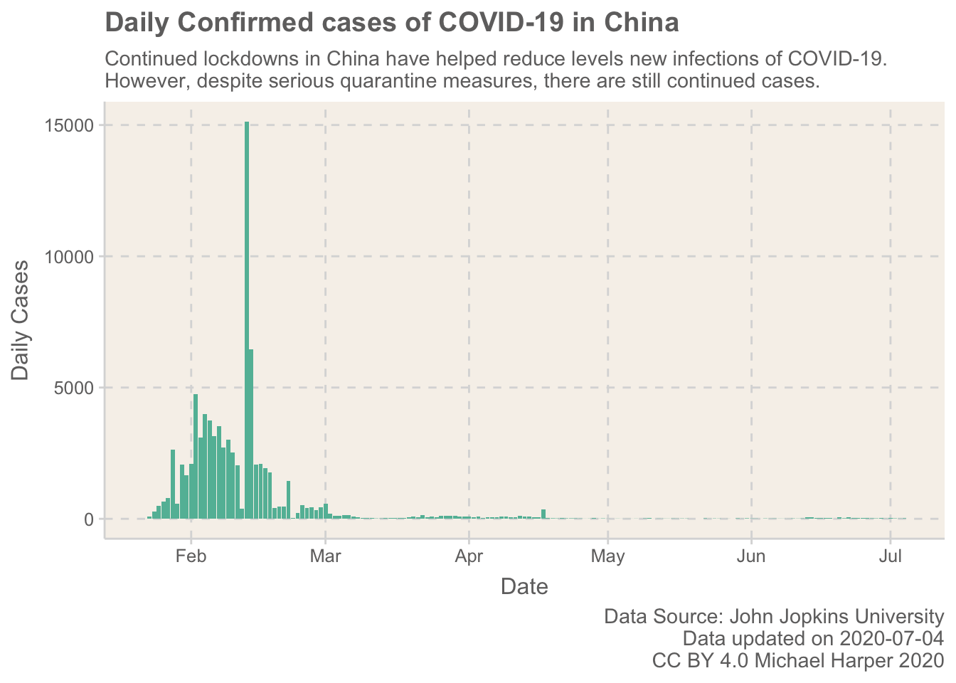
China as an example
A lot of the focus within the UK has been on the idea that the new lockdown measures will be a short time, with Prime Minister Boris Johnson has said he believes the UK can “turn the tide” against the outbreak within the next 12 weeks and the country can “send coronavirus packing”. While indeed we can make significant measures to reduce the spread of Covid-19 over the coming months, the battle will indeed be much longer.
To explore this, we can look at the example of China, who have been within quarantine for 8 weeks. One argument which is commonly used to provide optimism (most typically by those people who are trying to downplay the concerns) is that China have shown a massive reduction in new cases. This is indeed true, and it provides us hope of what proper lockdown measures can achieve, however, critically, there are stil indeed new cases being found. If normal life resumes at the end of the lockdown on 8th April, it is likely that there will again be an increase in the numbers.
However, the idea that this can be over and done with is increasingly becoming clearer to both the media and the broader public. As summarised well in this BBC article, we have several real options. The only way in which Covid-19 could be ended quickly is if a large proportion of the population become infected, something which clearly is not idealy.
If you want to get an understanding of the longer term implications, I would strongly recommend you checkout the tool which lets you explore the different type of mitigations and their impact they will have on the spread of the virus: https://neherlab.org/covid19/.
Conclusion
Reflecting on this, I felt like there were quite a lot of negative points to be drawn. Rates are growing in many countries, and even countries where rates are reducing are not out of harms way. However, I do think that at this stage of a pandemic, it is really important that the risks are communicated. The cost of inaction is too high to pretend that things will be okay. Yes they can be okay, but it will take concerted effort from the population over long periods of time to do this.
For those interested in the technical background to these plots, you may wish to check out the code which is available here.