Infection Rates
The second important piece of information is the infection rate. This is provided by the ONS survey, with the data available here. Note the data is slightly out of date, and therefore will not provide me with loads of data for December.
Simulate a death dataset
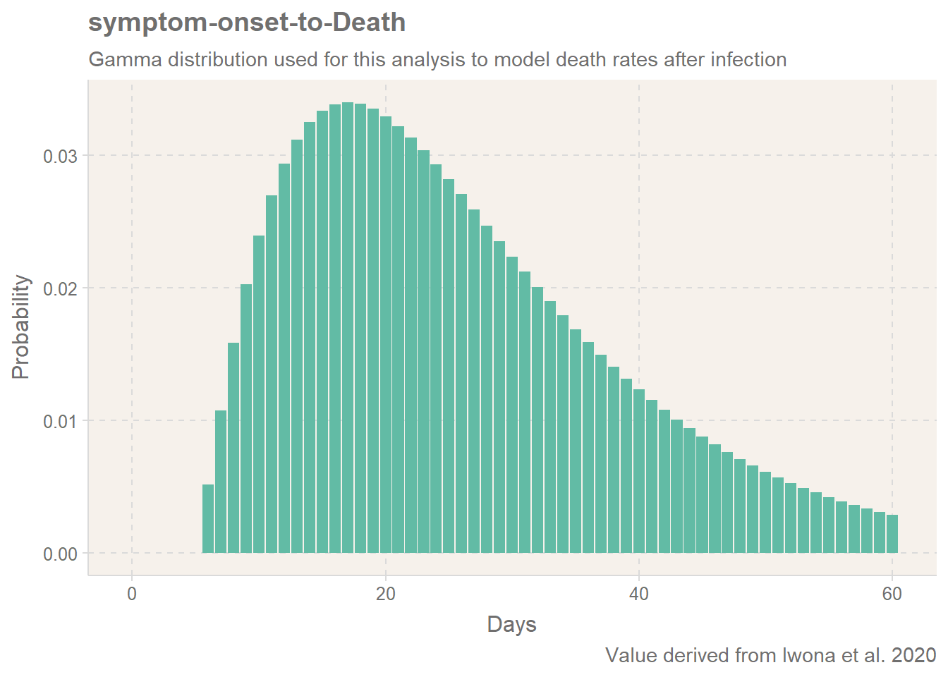
Based on the two values, we can now simulate how death may vary with infection levels. To do this, I will take the daily infection rate, and project the expected level of death for the following time period. To help make a direct comparison, I will only look at deaths within 28 days of a positive test. I will make the assumption here that tests were only taken after concerns of symptoms (5 days).
Note, for the purpose of this comparison, I don’t actually need the absolute number: I am more interested in the relative pattern of the data for the comparison. In fact, I am trying to actively avoid giving an exact number of death, as for this I would need more information: there are too many additional variables needed to accurately model the death, so it would be misleading to even suggest this.
As the average positive infection lasts 4 week reference, I will divide my infection rates by 28 to avoid overly boosting the figures as I am calculating this daily. For each day, we will forecast forwards. If the code below looks like it was written in a hurry late at night, then you are correct!
Results of Simulation
After this processing, we have a data frame which gives us three columns: Date, Percentage which refers to the ONS Covid Survey Infection Rate and deathIndex a value which indicates the level of death we would expect on that day given the infection rate from the previous 33 days. Finally, period indicates the time period to help compare the work with Joel’s analysis.
| Date | Percentage | deathIndex | period |
|---|---|---|---|
| 2020-08-02 | 0.0004752 | 1.29e-05 | August |
| 2020-08-03 | 0.0004795 | 1.34e-05 | August |
| 2020-08-04 | 0.0004865 | 1.39e-05 | August |
| 2020-08-05 | 0.0004941 | 1.43e-05 | August |
| 2020-08-06 | 0.0005000 | 1.48e-05 | August |
| 2020-08-07 | 0.0005027 | 1.52e-05 | August |
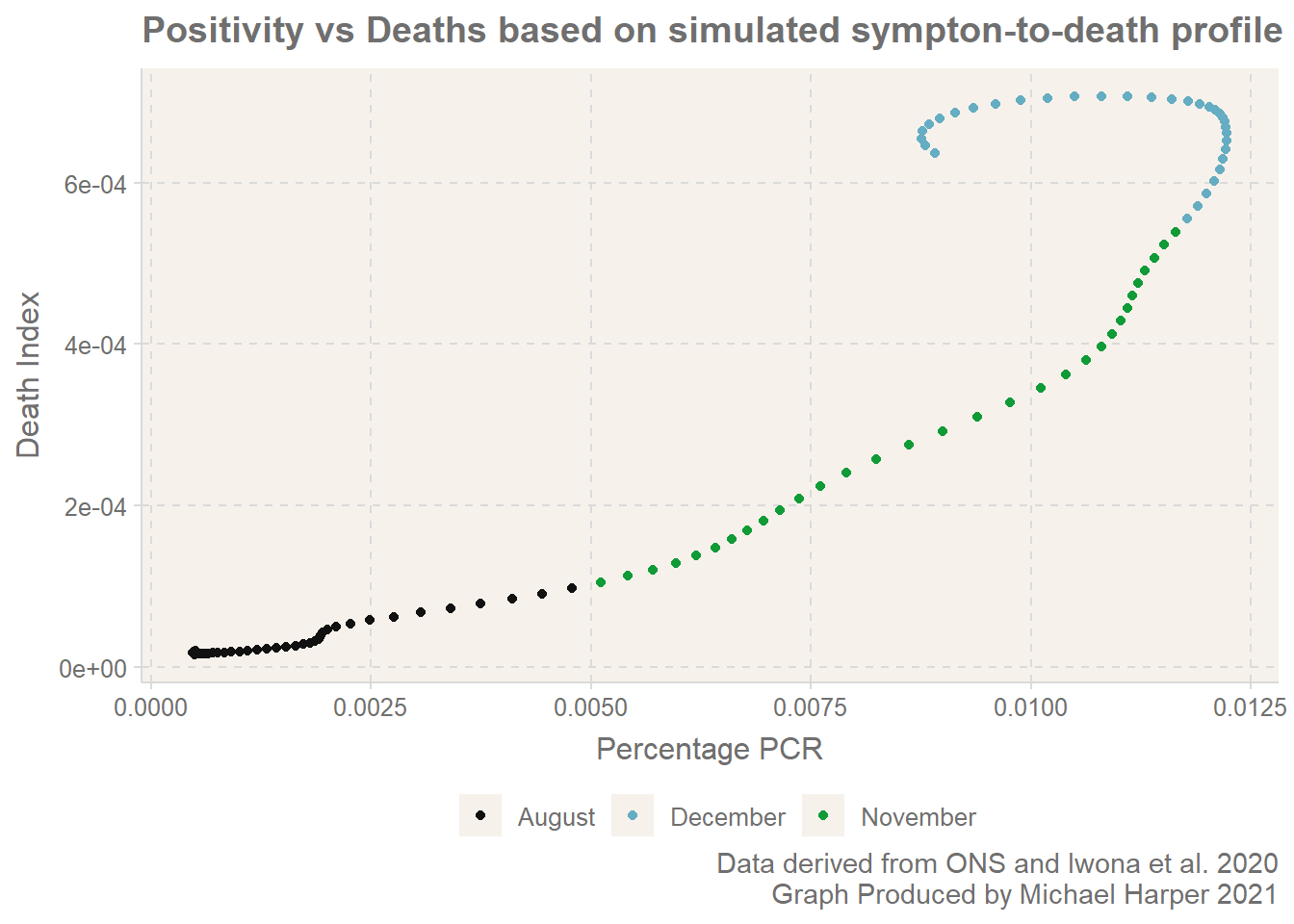
We can also look further forward and compare the number of deaths X days ahead of the date. Here we go 12 days ahead for comparison with the results from Joel. And look, here we have. It exhibits the clear kick backwards and starts the looping on itself. The line is by no means as jumpy as the results from Joel, but this is because of the simplicity of the model.
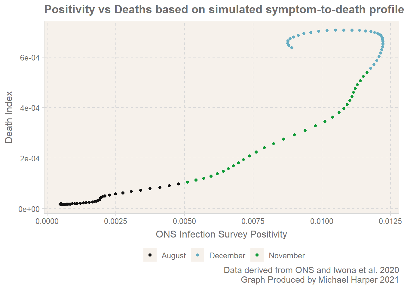
Figure 1: Simulation Results
It appears the graphs made by Joel include some more data which I have not been able to source?
What is happening?
In times when there are slow and gradual changes in the infection rate, there may be the illusion that the infection rates and deaths are directly correlated. However, when there are rapid shifts in the level of infection rate, either upwards or downwards, we are likely to see that the linearity begins to break down.
To reflect specifically on what has happened on the UK, we have undergone a fairly inconsistent few months. The combination of the lockdown in early November, the new strain, Christmas mixing and now the next lockdown have led to quite rapid shifts in the infection rates. To further complicate things, many of these events have happened within the 28 days of each, and therefore the death statistics will be difficult to separate entirely for each event.
Conclusion
I hope this provides a useful overview of how statistics don’t always behave as you might always believe! We can expect there to be intuitative relationships between datasets, but it is only when you dig deeper into the mechanisms of how things behave that you appreciate the factors.
If you have any queries or questions, I welcome comments! This is really designed as a rough-and-ready example to highlight the data. If you would like to see the source code and data for this, feel free to check out this article on GitHub here